Create Demographic-Based Coverage Map
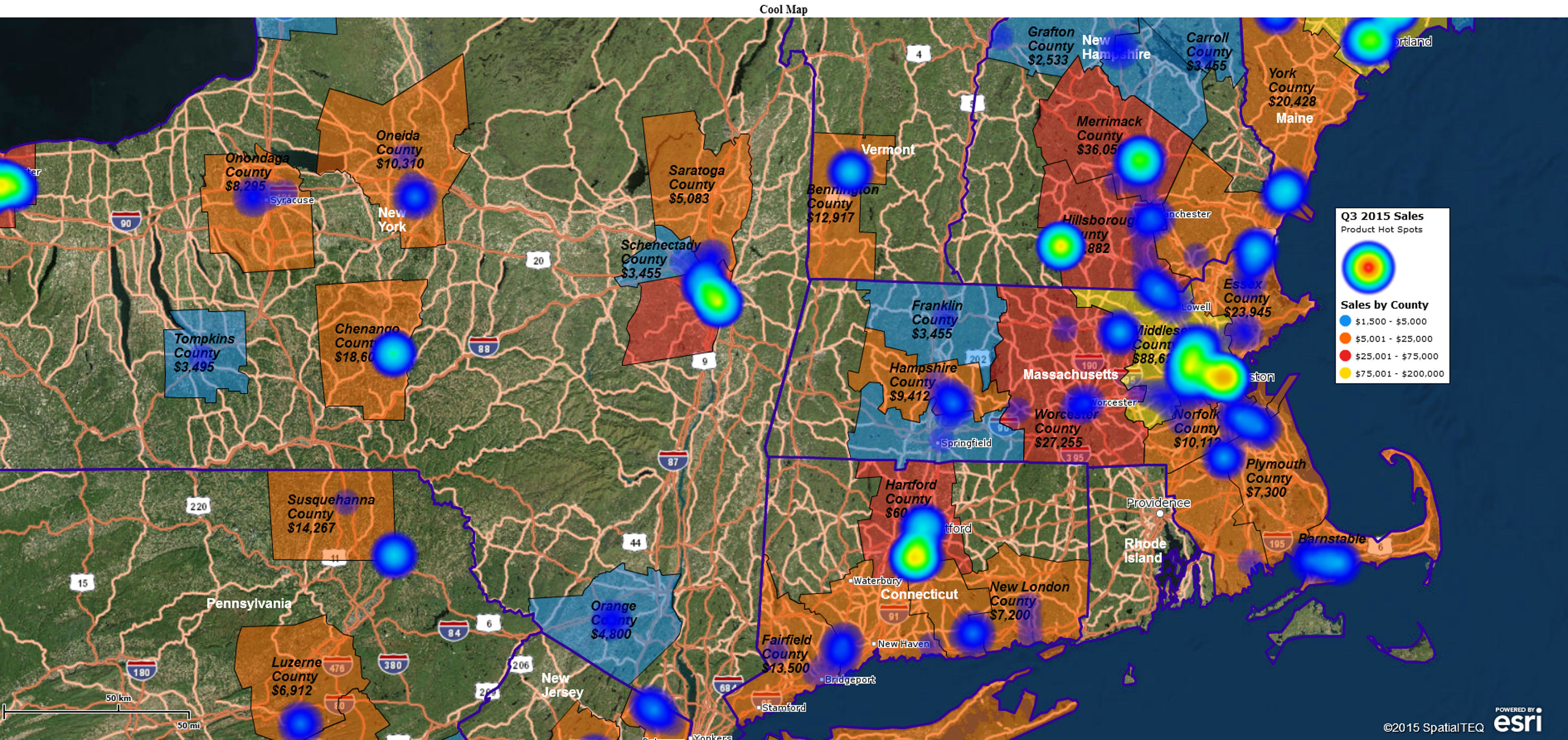
If you were searching for a tool to create a coverage area map based on ZIP codes which were color-coded by population demographics, someone might send you off looking for a heat map. “That’s a heat map,” they might say, “Go find yourself a heat map. Yeah, that’s the ticket.” And they would be partly right. Some map users call color-coded ZIP code maps heat maps. But that doesn’t fully address your coverage area requirement.
Plus, a MapBusinessOnline heat map applies a color intensity layer over a map background that looks more like a weather map than a demographic analysis by ZIP code. It derives that color shaded intensity overlay from a numeric column within your imported location data. It’s cool and may be useful to your business but it’s not what you want in a coverage map.
State Your Map’s Purpose
Try writing down what your map requirements are in one paragraph; a few key sentences. This will keep your first map project on target. Keep it simple. If you find multiple types of maps listed, start again. In our example the paragraph might read like this:
We need a territory or coverage map based on ZIP codes. The ZIP codes should be color shaded based on Census population. It would be nice to show total coverage area population as well.
Try to keep the map focused on no more than three business map elements – in the above case, coverage area, population, and ZIP codes. You may be able to add more elements, but begin with fewer. Maps are for communicating – simple maps communicate better.
Coverage Area or Territory
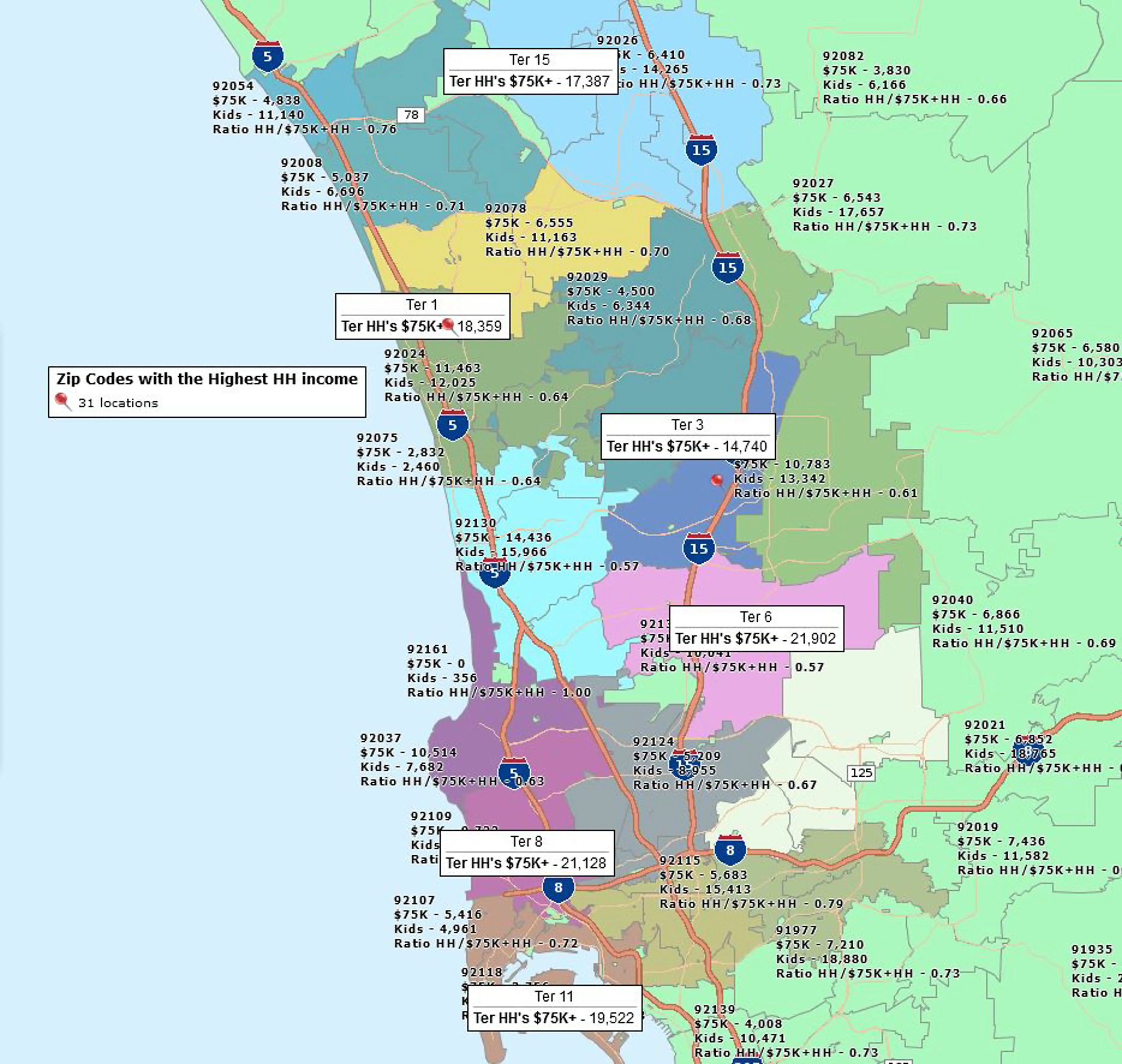
For a first pass map of your businesses coverage area, either approach works, a simple collection of ZIP codes using a polygon search tool or an imported territory. If you have a list of ZIP codes with territory names included build a spreadsheet and import them. Or simply grab a polygon tool from the set of Search Tools and draft a line around your coverage area of ZIP codes. It doesn’t have to be perfect on the first pass. Editing ZIP codes from a map object is easy. Create that coverage area and name it.
To get those ZIP codes color shaded by population (or any other Census category) either use the Three-Piece Puzzle icon or hover over the ZIP code layer in Map and Data and click the Edit Gear. Choose Color Code Map, select and adjust your Demographic category and tweak the range scope and the number sequences. Colors are controllable by you as well. Click Done.
To see the color scheme by population through your coverage area, hover over the Territory layer in Map and Data, click the Edit Gear and under General move the Transparency scroll bar to the right. This will expose your shaded ZIP codes.
Add Demographic or Imported Totals to Labels
We’ve got one more goal for this map based on our mapping requirement assessment above. We want to show territory label totals. To do this select the territory label itself, click the Edit Gear, choose the label Tab and Click Format labels.
You’ve got five flex fields you can fill with data in the label. Only add what your map viewer needs to see. Don’t over do it. In this case, Select Number 1 and choose Demographic Data in the drop down. Then select population. Add a little prefix text if you want, maybe “Pop – .” To post the label click Change labels.
For this particular map, consider going back to the ZIP code layer, clicking that Edit Gear, and editing the Custom Label, as opposed to Auto labels. This would enable a pop-up label when you hover over a ZIP code which could include demographic data related to each ZIP. It’s a convenient reference if population is always a concern in your business.
Fine Tune Your Map
Take a fresh look at your map. Do the colors look appropriate? Hot colors for high population, cool colors of low population. That’s a suggestion. Are labels big enough for all to read?
Will the map make sense to your map audience? Are there some things missing? For instance, it doesn’t take much to plot the company address on the map. Always a nice touch. Is the map legend succinct and meaningful? Make sure the legend adds value to the map – get rid of superfluous legend content. It’s distracting.
Export and Share Your Map
Once your territory map looks the way you want, it’s time to share it with your team or stakeholders. Use the Export Map Image function to create a high-resolution PNG or JPEG file suitable for presentations and reports. If you prefer interactive viewing, publish the map as a shared web map link so others can pan, zoom, and explore data themselves. You can also save your project in MapBusinessOnline for future updates or to use as a template for other regions. A well-prepared map becomes a powerful communication tool that clarifies your business coverage and supports data-driven decisions.


