How to Build a Dot Density Map
A dot density map is a classic business data visualization exercise. Business data visualization is probably the most common and straightforward way to apply business mapping software to your business.
Many companies ask how to import and view customer data in a way that helps them understand more about their business. The dot density map is one of the easiest and most helpful maps for visualizing business data.
Many companies have only a few hundred customers to locate. But it’s not unusual to run across customer datasets of five to fifty thousand customers, or even more for large enterprises. Without a business map, marketing managers are forced to filter their Excel spreadsheets to compile segmented customer lists for action. Spreadsheet lists do not display patterns the way maps do.
A business map ingests your customer lists and then distributes them across the coverage area of your business based on address. Map layers are turned on to enhance your customer list against a variety of background layers:
- An accurate street map view lets you view significant roads, rivers, and mountain chains impacting customer access.
- Satellite and aerial background views can add building views and landscape details like tree canopy.
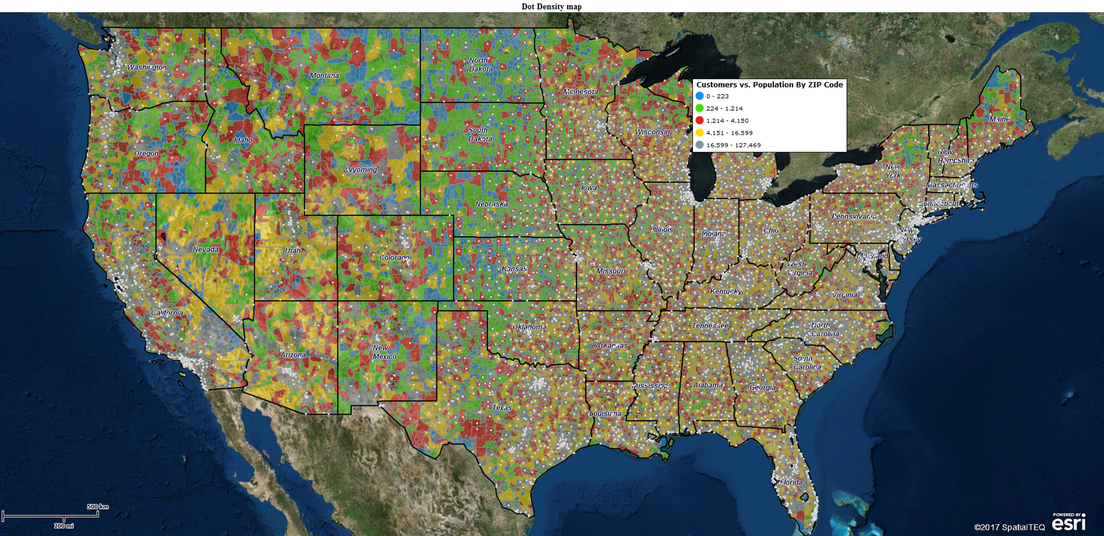
- A ZIP code layer allows your map analysis to compile customers by ZIP code or create territories.
- Counties and states provide similar but larger area designations for coverages and territories.
- ZIP, county, Census Tract & State layer enables the inclusion of demographic data, at times critical to understanding your market and developing an optimum customer type.
Regardless of which background map layers you choose to work with, a Density Map view offers an accurate visualization of where your company is doing business.
How to Create a Dot Density Map
- Gather an address database or Excel spreadsheet of your customer locations. Arrange separate columns with headers for location data: Name, Address, City, State, and ZIP code.
- In the Map Business Online master toolbar, click the Plot Data on Map button. Browse to your data and click next. Verify location columns accurately match the map applications address buckets and adjust as necessary. Click Next.
- Choose Company Name or a similar assignment for the name column. Assign columns of your choice to the five label flex field options. Process the imported location points to the map by clicking Plot.
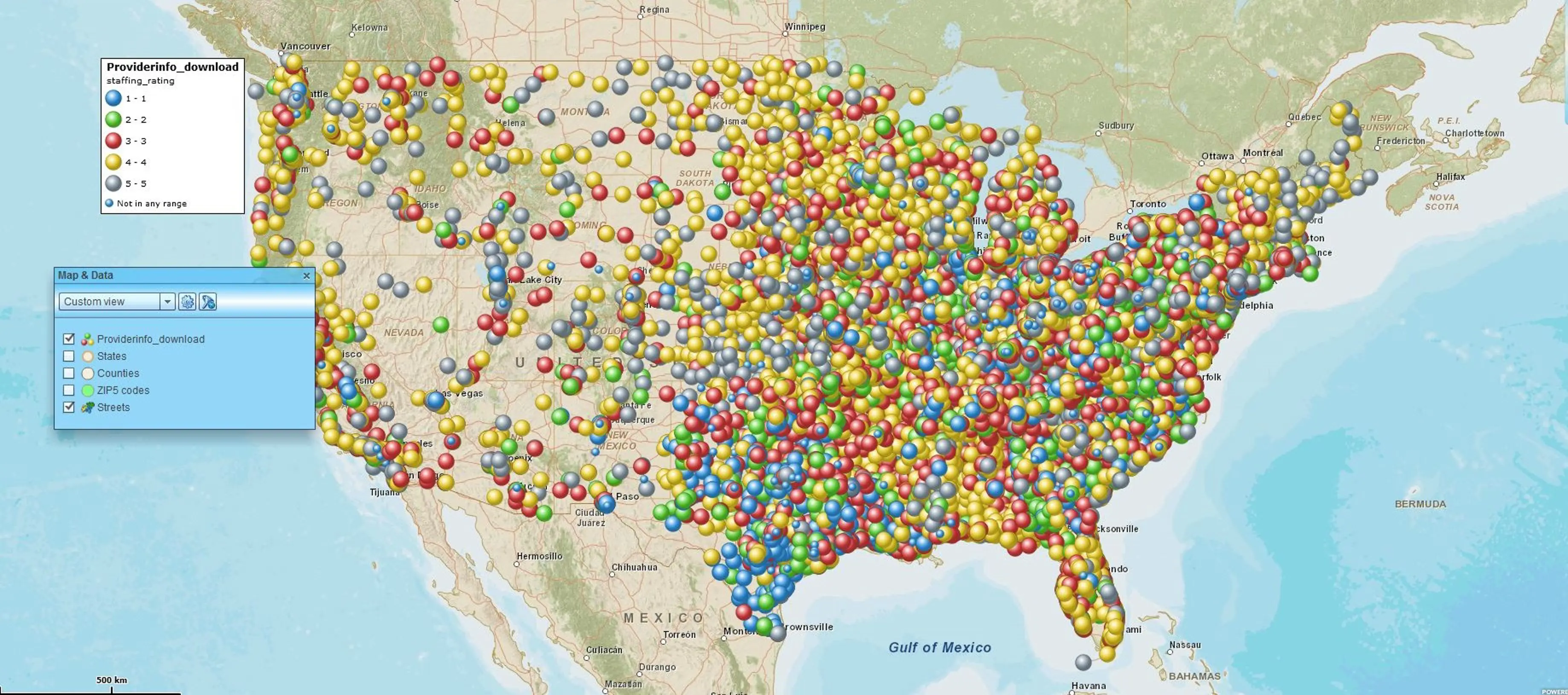
- After importing, MapBusinessOnline opens the Data Window with your imported data selected. In the Symbol Selector Drop Down located on the left of the Data Window toolbar, choose a small black dot for your location point on the map. Increase its size to 80% – more or less to your liking
- Sit back and view your customer data on a USA, Canada, or UK base map and think about the results.
Viewing a dot density map exposes areas of concentration – data dots build up in some spots and don’t exist in others. Typically, these areas of concentration are populated, urban areas. But that really depends on your data. In your particular case, data may be concentrated in rural areas – dairy farms, deer fields, and snowmobile repair businesses may tend toward rural placement.
View your data with an open mind and an eye for patterns. Business maps are trying to tell you something.


