Business Maps & Data Visualization Software
The Power of Business Maps
Many businesses find it challenging to analyze, organize, and distribute large amounts of data. In the era of "big data", the most powerful features of business mapping software are data visualization capabilities. You can view your customers, prospects, dealers, and competitors against a background of up-to-date maps. For over two decades, MapBusinessOnline has provided innovative data mapping software to companies of all sizes across a broad range of industries. Our mapping solutions will help you easily import large volumes of your business data - whether it's from an Excel spreadsheet or a CRM system - onto a map of your target area of interest.
Watch your data come alive, uncover trends, reveal geographic patterns, and share map views with your staff.
You can construct business data maps to illustrate nearly any aspect of your business, and from any perspective.
Visualization Features
- Easily import customer data from text files, CSV files, database files, or Microsoft® Excel spreadsheets.
- Business data can be plotted on a map by street address, city name, ZIP code, postal code, or latitude and longitude — in the US and Canada.
- Plot and visualize data from a variety of accounting systems and contact management solutions, including Microsoft Dynamics® or other CRM software, and Intuit QuickBooks.
- Map several hundred thousand locations per map in a matter of minutes.
- Use a variety of map symbols to identify critical business data, or add your own symbols.
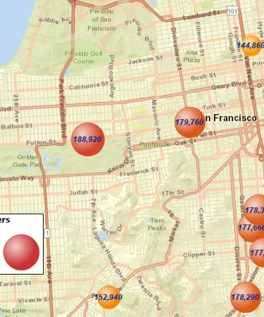
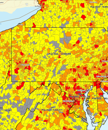
- Color-code maps by point or administrative district based on sales volume, customer type, product type, or other relevant criteria. Represent numeric data with contrasting colors.
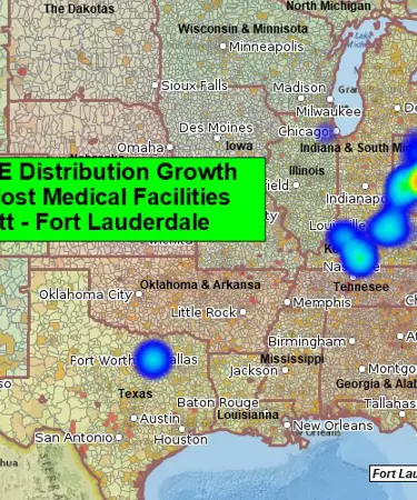
- Emphasize areas of customer density with heat maps to reveal market saturation and identify areas of opportunity.
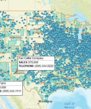
- Label your locations with several lines of data: product information, sales results, contact information, etc.
- Add Census demographic data layer to build maps that display population, income, or other parameters using color or labels.
- Create radius maps – search business data within a radius or a polygon.
- Share maps through MapBusinessOnline’s interactive web map, images, or printouts.
There Are Free Mapping Tools; Why Pay for Specialized Software?
Going with a free mapping tool may seem like an obvious idea at first. However, the time and effort required to select the right free tool and work around its inevitable limitations may not be worth the cost of the MapBusinessOnline Starter subscription plan – the most basic of our plans.
Here is how the most basic MapBusinessOnline Starter plan can serve you better than free mapping tools:
- Load and handle many more locations: 20,000 points on a map VS about 10x less with some of the well-known free tools.
- Easily add Census demographic data to a map: Rich Census data available for any area from a ZIP code to a free-form polygon VS no Census data overlays available in free mapping tools.
- Use up-to-date ZIP code data, including both boundaries and points.
- Multiple, highly customizable color-coding options, including heat maps, symbol maps, bubble maps, and chart maps. Color code locations or areas on a map.
- Aggregate imported or provided data by ZIP code, county, state, or any custom area.
- Build optimized routes between your locations on a map: MapBusinessOnline optimizes up to 250 stops per route VS about 10x less, or no routing capabilities, with free tools.
- Integrated business listings data: 22+ million businesses searchable and plottable from within MapBusinessOnline VS manual search, external data import, or coding – as the only options available with free tools.
- Share your business maps securely with other MapBusinessOnline users: We don’t have access to your data or share it with 3rd parties.
MapBusinessOnline is one of the most feature-rich and affordable data visualization tools on the market today. Whether you use MapBusinessOnline for market analysis, sales territory mapping, site selection, or anything else, you'll benefit from its advanced business visualization techniques and tools. Ultimately, the platform will help you see your data in a new context and uncover the hidden patterns and opportunities that will drive your success.
See MapBusinessOnline in Action
Request a demo
Popular MapBusinessOnline features
Quickly Build Map Visualizations of Your Business Data

Map business data from multiple sources by street address, city name, ZIP code, or latitude and longitude. Plot 250,000 or more data points on a map at once. All you need to begin is a spreadsheet with business data, such as a list of customers.
Assign Symbols to Your Business Data Locations

Assign specific symbols, colors, and sizes to your business data points to make them easily distinguishable. Choose from an included library of symbols or create and import your own. Visually define customers and prospects across thousands of locations using symbol color coding.
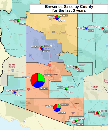
Illustrate Business Trends or Comparisons with Charts

Graphically depict your business data on a map using pie or bar charts. Visualize multiple values per location using charts with a customized look, color scheme, and size. Use charts to show revenue by product, invoices due vs. paid, items ordered vs. shipped, sales by customer type, or sales by year.
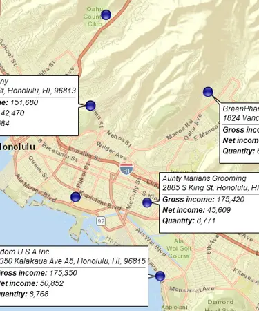
Label Your Business Data Using Flexible Callouts

Show multiple callouts on a map at one time. Add notes to individual map callouts. Change callout orientation for better map layouts. Customize callout look and feel.
Draw Custom Graphics on a Map

Add drawn circles, rectangles, polygons, or lines to your map. Choose from a variety of line styles and fill colors. Identify critical map locations with text labels. Draw market areas and sales territories. Customize your business map with data mapping software.
Share Business Maps

Create interactive maps and share them with friends, colleagues, dealers, customers, prospects, or vendors. Create high-resolution map images and share them as JPEG, PNG, or PDF files. Embed map files in PowerPoint presentations. Export map views as PDF files for large-format printouts.


