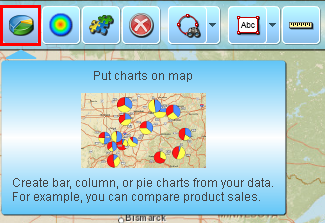
Show charts for dataset locations
- To color code data with charts click pie chart icon on the toolbar.
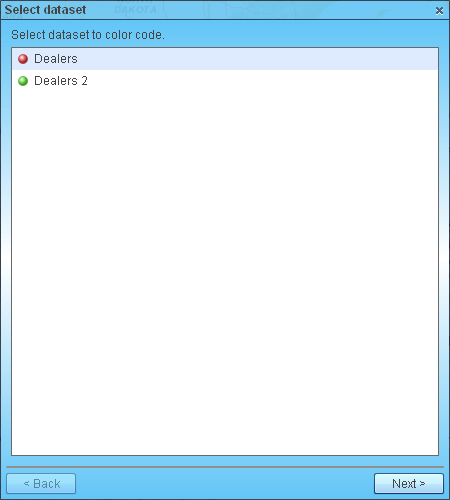
- If you have plotted several data files on map, select one to color code and click ‘Next’ button. Otherwise just skip this step.
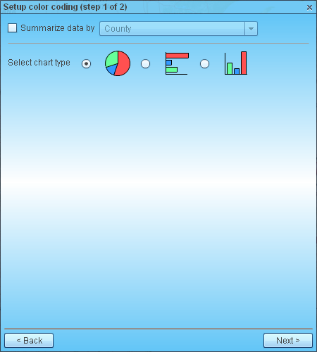
- Check the box if you want to summarize data by territory/geography such as State, County, or ZIP code. If you summarize data by state, for example, then Map BusinessOnline will put chart at state’s center point with data aggregated from all locations plotted in the state. That is sort of clustering plotted locations for you to visualize sales by product and by state.
If you leave the check box unchecked then MapBusinessOnline will add charts at actual locations such as address or city (depending on what you selected in Plot data wizard).
Select desired chart type: pie, bar, or column chart.
- On ‘Define color coding’ page choose following charting options:
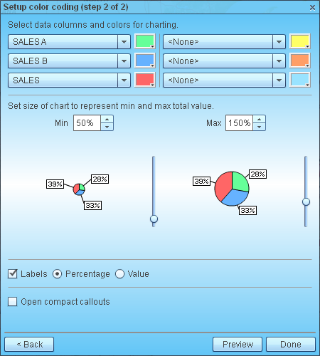
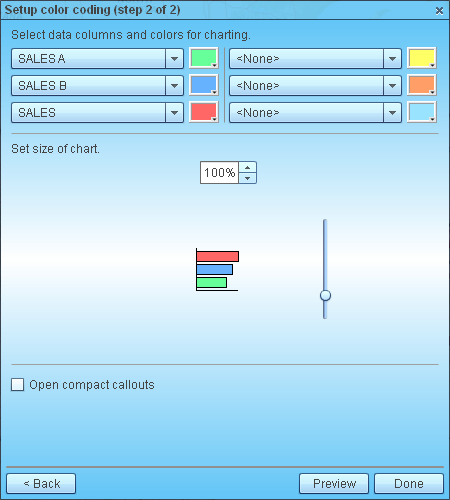
- Choose data columns with desired data, for example sales by product.
- Select a color for each pie, bar or column in a chart.
- Set minimum and maximum pie chart sizes, or size of bar or column chart.
- Pick type of label for pie charts: percentage or value.
- Choose to open compact callouts (type of labels) for each chart. You can show additional location’s data in callouts. Check this article for more info: Customize dataset callouts
Chart samples are updated as you are selecting various options.
Click ‘Preview’ button to see charts on map without closing this page.
Clicking ‘Done’ button will close the page and add charts to map.
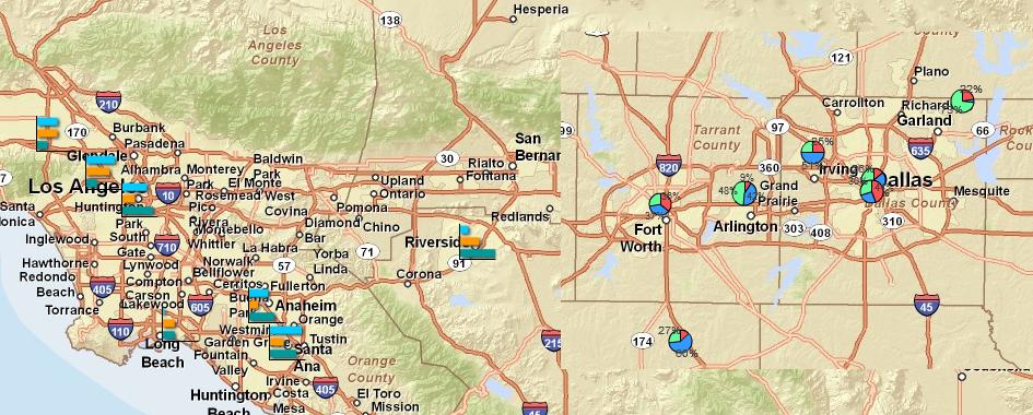
- Here is example of map with charts.