Business mapping software offers a geographic background for your business data. How do you choose which data visualization tools to use? Let’s start with Symbology for this blog post.
Remember, you are importing your business data as a spreadsheet with each address component listed in columns (address, city, state, zip). You can include any number of data columns that reflect your business. People often import these data columns for map display: sales results, product offerings, customer classifications, coverage areas, territories, and many other business related data records. Most users simply map Excel data.
In my digital map world, working first for www.DeLorme.com and then for www.MapBusinessOnline.com, I got used to calling visualization tools symbology. Symbology could be dots or map flags located on the map by address or zip code and reflecting your business data. Symbology could also refer to imported symbols that you choose. Symbology can be symbols of variable size, and color. Sometimes you can add text or numbers to your symbols. Symbology can also be a heat map representation of your business data. Think of the whole data mapping process as symbology.
The options are many. There is no perfect symbology for your particular business data. You should consider the options and match them to your audience.
Knowing Your Map Audience
Map audiences are dependent upon the task at hand. You may be sharing maps with a sales team to show territories. Or you could be creating a revenue map for the executive team and your finance department. Another popular mapping audience is your customer, who might be interested in your coverage areas or how often your sales people visit. Understanding your map audience helps you decide what symbology approach to use.
The Boss vs. the People
In general I find that executive audiences want to see everything on one map but they also require clarity. These two requirements can be difficult to reconcile. Executives are pressed for time and used to solving problems fast. So be prepared for your boss to ask for more and more layers of data on your map. Push back. Explain that map clutter can ruin the effectiveness of you business map. Explain that you can easily build two maps – one for tax planning and one for sales accountability, as random examples. Suggest that he take a “chill-pill.” Well, maybe hold back on that suggestion.
Executives and accounting people like to see money. So try to choose symbols that allow values and dollar signs to be shown. Consider totaling sales by county, state or territory and displaying those numbers in an uncluttered way. Chart and graph symbols work well too, especially if you have two or three years’ worth of sales data to compare.
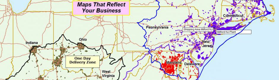
Sales people and business managers often like to view densities of data. They like to look at the map and quickly see where most of the action is. I find smaller black dots work well to display concentrated sales activity by area in a simple way. You can tweak the symbols sizes and colors to try different looks, but this density view can be a good starting map data layer. For example, where all the hospitals are located across the USA.
Another density view is the heat map. A heat map makes your map look a bit like a severe weather map. And that’s good because it wakes up the audience with splashes of bright colors that show hot spots or densities in your business data. Those hot spots could represent sales, donors, epidemics, deaths, births, or any number of imported data points.
Territory Accountability
Territory maps communicate progress against goals. To further that communication overlay a heat map layer to indicate where the over achievers and the under achievers are doing all their achieving. You could also try color coding by circle symbology. These expandable circles can be colored, oversized and undersized, while also displaying numeric values from your data columns, like sales data totals. In this fashion you can over emphasize success in large green colors and highlight low sales in ominous dark gray tones with Lord of the Rings,’Bilbo’s lost again’ music cued to play.
Grow Your Own
I mentioned earlier that you can import your own symbols. This can be helpful for marketing projects. Import a client logo and show those points on key map locations. Import-able symbols are usually just small Jpeg files you can grab online. Avoid logos with lots of border space. They tend to present too large on the map. Find ones that focus on the logo itself.
Color Coding Data Points
Color coding map symbols based on a column of your business data is possibly the most powerful way to view your business data. It lets you describe your data based on categories that your business defines. Typical examples of these categories are customer types, prospect types, clinician skill sets, patient statuses, product focus, or the retail chain of distribution – i.e. distributor, reseller, and outlet.
Warning: I recommend not trying to symbolize too many data types. For example, trying to assign a symbol for each of 45 sales people will lead to map clutter. Use data label options for that kind of identification.
When color coding symbols simply select your data and then select the column within your spreadsheet that you want to color by (your categories). Next choose a range of colors to assign – do you have three types of records? Choose three colors. Remember, too many colors may confuse your audience. Always defer to the KISS rule (Keep It Simple Stupid.)
Next tweak the colors and symbol sizes as required. Then view your color code scheme. You can always go back and redo it. It’s way easier the second time around.
The Map Legend
Your color coding key is displayed in the map legend. That’s where your audience will look to understand what your colors represent. The map legend is fully editable. You can rewrite data layer names and line titles in the legend as required. This is another opportunity for you to tailor you message for your audience. Keep it simple and clear and your map will be more appreciated.
Armed with your digital map symbology tools you can now experiment with different map views that inform your particular business community. And use the word symbology around the office a lot. You’re in the map geek elite now.
Let a map help you learn about your business.
Review us at Google+ or at Best Vendor