A map in many ways is a work of art.
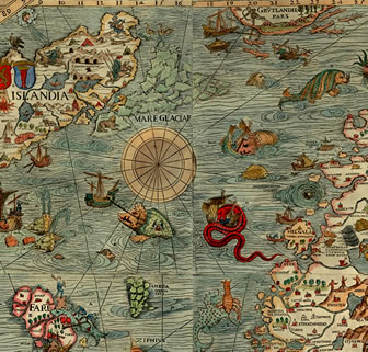
Back in the middle ages navigation maps were hand drawn or painted to represent places on Earth. These maps often included drawings along the edges which depicted frightful imaginary creatures that lurked in lands unknown. Back then the unexplored areas of the Earth were assumed to be filled with terrible things. Scarier even, I suppose, than the Spanish Inquisition, Attila the Hun, or being married to Henry the VIII. To name just a few known and man-made terrifying aspects of the time.
Today’s maps tend to be all business, although one can find more frivolous maps used for craft fairs and local businesses. Still, digital maps can be a work of art in that they are beautiful, interesting and colorful. And that beautiful aspect of your business mapping could serve you well in your endeavors.
Any business map maker is an artist telling a story against a canvas of states and ZIP codes. Our artistic map palate is a set of digital colors which we control. We add layers of boundaries and data points that we can color adjust and symbolize to help our viewers ascertain information more easily.
Realize that your constituents, viewing your sales territory maps or your demographic map analysis, will be more impacted by a well thought out and beautiful color and boundary scheme then a basic boring map with a few
There are few official guidelines for the art of creating a beautiful business map. A map maker can make their map any color they want. They can include all the layers they want and label as they see fit. In my experience some map works of art are better than others. Some fly a little closer to the higher art of map making.
Here’s an example of a beautiful map I found on the GIS Map Exchange website. They explain the map’s beauty; it’s ability to describe cancer related mortality ratios in a simple way. But the map also utilizes a dark background and white state borders that allow the viewer to focus easily on the map’s intent.
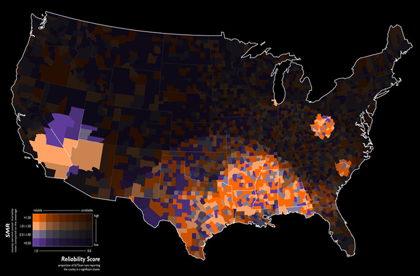
Source: Geographic Information Systems Stack Exchange
Map Background Options
We’re so lucky compared to map makers of old. They had no map background to build upon. Until the 19th century map scale and map projection were rudimentary at best. Whereas, today’s map geek pulls up a base map instantly and simply goes to work. Map scale is automated and resets automatically based on zoom level. Digital maps generally use the web Mercator projection, keeping most web maps looking and feeling consistent.
In Map Business Online the user can choose from four different map background options. These options are easily explored. And don’t forget, at times you may find that no map background at all brings a certain sparse clarity to your map’s intent. Don’t be afraid to go all nudy-kazoo (map slang for no map background) because your map may not require a background layer. Ask yourself, does a map focusing on county population really require roads and towns? It may, or it may not. You, the map maker, must decide.
Topography, as a map background can be striking. Using topographic views in your map work can be beneficial or it can also be a distraction. Make sure your topographic use matches your business map intent. Experiment with different map backgrounds.
A Map of a Different Color
Here’s a series of maps designed to express information about poverty in the USA. Notice the way these maps utilize color. Blue and Red are somewhat opposing colors which lend themselves to depicting contrasting trends depicted in online business maps. Also notice that the maps listed apply various map layers depending upon data sources. Some maps focus on counties while others color code at the state level. Some maps are zip code maps, others are just not.
Map Business Online offers a pallet of colors and shade gradations from which to choose. These colors can apply to a variety of map layer or jurisdiction options so the map creator can select what is most appropriate based on the map data structure and purpose.
Any region selected offers a color box for fill color adjustment – simply follow the Edit Gear pathway and click into the color box. Once inside the color box, choose from the color shade options. If you know a specific hex color code for your color preference try typing it in.
Once your area fill colors are selected remember to review your border thickness and border color. Then adjust your area transparency controls to see if a little less color or brightness serves your map better. Transparency controls also allow the background map to show through – or not.
When color shading areas such as ZIP codes, counties or territories think about your map audience. How will your color choices impact your map viewer?

Would 50 shades of gray work?
Soft Map Audience – Are your map viewers already engaged in the maps purpose so that the map is simply more information? For this type of audience, I might choose non-threatening pastel colors for a warmer more relaxed map view.
Examples: A successful donor campaign committee meeting, new employee orientation
Map to Impress – Are you competing for map audience attention or are you trying to sell the audience on a concept? Use bold and bright colors to make your case. Look for high contrast colors for good and bad, high or low concepts.
Examples: Proof of concept product meetings, selling an executive team on a new corporate initiative.
Intelligent Audience – Are you presenting your map to a skeptical group of well-read scientists and thought leaders. Present clean maps with minimal clutter. Use rich darker colors with sparse background. Consider a detailed topographic layer if at all appropriate.
Examples: Presenting new health related findings to a medical community, explaining a decline in Opera Company revenues to the board of directors.
Maps tend to be used for business, but maps are really just an amalgamation of colors, shapes, and lines. Seek to understand the power your map medium has over your map audience. Learn to include a dash of beauty in your business map. It could make the difference between OK and Wow!
NEW! Refer a business associate to Map Business Online in exchange for a $20 Amazon Gift Card!
Find out why over 25,000 business users log into www.MapBusinessOnline.com for their business mapping software and advanced sales territory mapping solution.
Contact: Geoffrey Ives geoffives@spatialteq.com or Jason Henderson jhenderson@spatialteq.com (800) 425-9035
MapPoint users please consider www.MapBusinessOnline.com as your MapPoint Replacement.
Please read customer reviews or review us at Capterra, G2Crowd (LinkedIn connected), or at the Salesforce.com AppExchange.