Illustrate Business Data on a Map with Charts
How to Illustrate Business Data on a Map with Charts
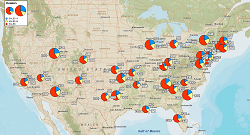
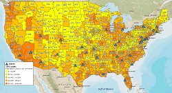
A great benefit of incorporating MapBusinessOnline mapping software into your strategic planning activities is that it provides an excellent way to bring your business data to life. Simply import data from your Excel spreadsheets or other resources such as Salesforce.com and QuickBooks, and you can plot selected data points on a map in the form of full-color pie or bar charts.
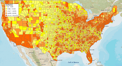
Displaying pie or bar charts on a map can provide a number of important business advantages. For instance, you can clearly see the breakdown of sales on a per-product basis for any region or territory you choose to target. You can also segment your customers based on certain demographic criteria such as age, gender, income or home value, which can prove invaluable when developing targeted direct mail campaigns. You can also see whether your customers are paying their bills by visually comparing invoices due vs. invoices paid.
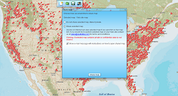
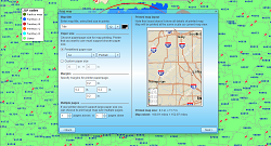
We’ve made it easy to learn how to illustrate data on a map with charts. Simply follow the simple steps for color-coding your data, plotting your data files, choosing the way in which you wish to summarize your data by geography or territory, and selecting the various options regarding chart size, labeling, values and more.
Chart samples are automatically updated as you make your selections, and you can preview your charts before completing the process by clicking on the “Done” button.
Feel free to contact us if you have any questions regarding how to illustrate business data on a map with charts.
See MapBusinessOnline in Action
Request a demo
Learn How Our Customers are Succeeding with MapBusinessOnline
"I just wanted to say thank you for this amazing mapping tool! I've tried a number of sales territory map solutions and this is by far the best. I just (finally!) switched over from MapPoint and this is so much better, I wish I had switched sooner. Your videos and blog are also really helpful, though most things I have figured out on my own. It looks like I also have a lot more to discover as I explore the data visualization tools. Thanks again!"
Andrea Harrison
Business Analyst
Brainlab, Inc.
DPS is the leading provider of timely, relevant and motivational promotional materials for automotive dealerships. Their business strategies drive customer loyalty and sales revenues. Their sales manager uses MBO to create and manage sales territories and describes MBO this way,
"The product is phenomenal and the support even better."
Dealer Product Services (DPS)

"We've tried the REST now we are using the BEST. After searching and trying other mapping programs for our delivery operations team and finding that we just couldn't get all the features that we required, we finally found MapBusinessOnline. Not only did it have all the features we needed including Longitude/Latitude and optimizing delivery routes, but it provided us tons of other bells and whistles. MBO proved to be a superb tool for our operations team to create routes and territories with the click of a few buttons while also allowing our reporting team to make beautiful maps that help our executive team visualize the story the data was telling. We are using this for the 2nd year in a row and will be renewing when it is time again. We pride ourselves at offering cutting edge applications to our millions of readers and subscribers worldwide and love that MBO helps us stay ahead of the technology curve by continuing to update their product and features. The release of MBO for the Desktop was a great addition and only helps make using the product even easier. To the staff at MBO — Keep up the great work!"
Dow Jones

Popular MapBusinessOnline features
Illustrate business data on map with charts
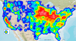
Emphasize customers density with heat maps
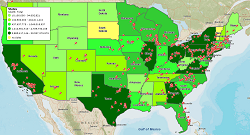
Color code maps by ZIP code, county, or state
Display business data against demographic maps
Build fast map visualizations of your business data
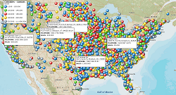
Visualize business data on map with various symbols
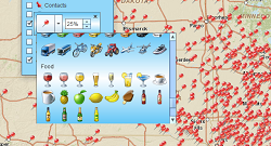
Add a variety of layers and data to map
Print large format map views
Share business maps