Data Visualization’s Positive Impact on Decision Making
In every field and industry, good decision making is one of the principal building blocks to success. Whether you are a high or low level decision maker at your company, it's crucial to have visualized info at your fingertips in order to communicate ideas effectively. With business development comes growing volumes of data. Depending on how this info is presented, it could be easy or difficult to sort through all the facts, findings, and patterns that must be understood in order to take things to the next logical stage.
What Is Data Visualization?
Data visualization technology provides a high-tech means for preparing the necessary information that enables sound business choices. It helps executives see the big picture all at once — from trends and numbers to hot spots and trouble areas. This allows people in different capacities of decision making to mutually identify the most likely routes for success, and to pinpoint the most efficient means for taking ideas forward.
The concept of visualized information has been put into practice for centuries. Variations of the concept have been employed in numerous settings — including science labs and universities — where data visualization has been used to study a vast range of topics, from the mysteries of outer space to trends in global financial markets.
Since the early 2000s, innovations in data visualization technology have advanced to the point where the practice is now employed throughout much of the business world. At meetings and showcases of big corporations, presentations that utilize visualization technology have come to be viewed as a vital component of communication between different business entities. As such, the technology behind data visualization has become an essential part of the business arsenal in today's corporate environment.
What Are Data Visualization Tools?
Data visualization is generally presented in formats that are designed to make sets of information easily understandable. Data is often conveyed through percentages, graphs, green lights, stop signs, meters, and other indicators that communicate whether something is good or bad. From there, the decision makers can determine which route to take. If the indicators are discouraging, they will likely take a different course of action than if the data represents an encouraging trend.
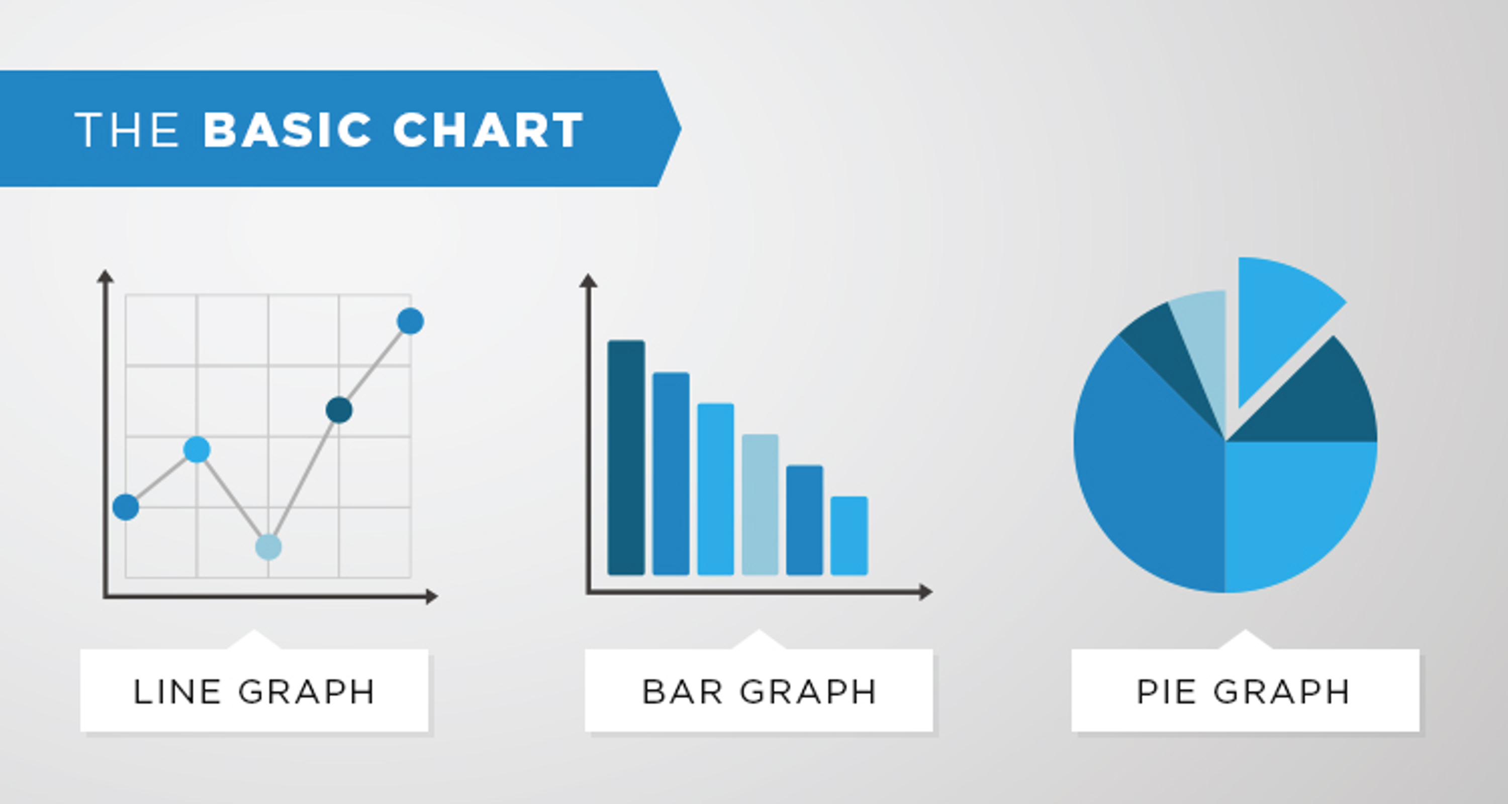
Of all the formats used to present data visualization, audiences most commonly use and understand the basic chart. It’s generally presented in one of three forms: the line chart, the bar chart, and the pie chart. The primary purpose of the basic chart is to present key pieces of information in a succinct and wholly digestible form, which in turn makes it easy for interested parties to absorb the data in as little time as possible.
For example, if a presentation is given on how to target millennial consumers based on the avenues of media that they most frequently consume, a pie chart could divide the different media avenues — computers, smartphones, magazines, television — into large and small slices based on percentages. This would offer a clear indicator of whether companies are likelier to reach young people via social media or through old fashioned commercials.
Another popular visualization tool is the status indicator, which uses symbols to convey a particular meaning within a data presentation. A status indicator can be represented by various types of symbols, including street lights and gauges. Status indicators are most successful at conveying information when parameters are incorporated, because this allows viewers to determine whether the information at hand is representative of a positive or negative trend.
For instance, if green, yellow, and red lights — respectively representing brilliant, mediocre, and miserable — are used on a chart to rate the performance across several categories of 10 different members on a team, the two who score green lights under each category are the likeliest to get promoted to a higher level.
Business Analytics Benefits
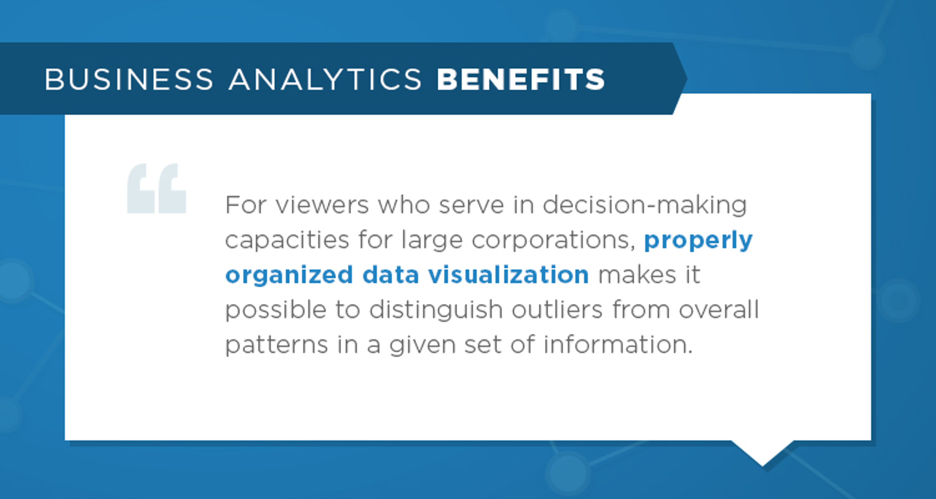
For viewers who serve in decision-making capacities for large corporations, properly organized data visualization makes it possible to distinguish outliers from overall patterns in a given set of information. In the most successful instances, visuals simultaneously manage to reveal conditions, patterns, and correlations between vital components and the effects they all have within a business framework.
Depending on how advanced a particular set of analysts might be when it comes to reading data visualization, an alternate and more complex format might be used in a presentation. Examples of such formats include bubble charts, geographical maps, scatter graphs, and tree maps. The appropriateness of these formats can depend on several factors, such as whether the information being examined is best presented with a more complicated chart and whether the industry in question is likely to grasp the data on display in such formats.
There is often a disparity, however, between analysts whose knowledge is based on one set of data visualization alone, and those who come to the table having viewed other charts and figures on the same topic. People in the latter category might have different interpretations of a figure than someone basing their conclusions on one source or situation. Often times, this can lead to disagreements among decision makers and end up stalling progress in certain areas of interest.
How Does Data Visualization Improve Decision Making?
Laying out data in a visualized format makes it easier to analyze a set of info, which in turn allows analysts to gain the most knowledge from a study or presentation. When paired with background and supplemental info, the visualizations are given additional context. In effect, the various forms of info complement one another. This combination of info makes it possible to quickly and easily recognize winning formulas, pinpoint areas with the greatest potential, and single out weak spots and cul de sacs. From there, decision makers joined by a common goal can pool together the knowledge and insights gained from all the info at hand and proceed to implement courses of action.
When it comes to identifying problem areas in a set of prior actions under review, data visualization puts all the negative results on display, alongside the positive, and gives analysts a clear contrast by which to base conclusions and subsequent changes. At its most successful, data visualization serves as a communication tool that instantly exposes the good and bad aspects of a given set of findings, and does so in a succinct yet thorough manner that leads experienced analysts to the most logical conclusions.
Data visualization is not a recent invention, yet it's often underrated and neglected among certain business organizations that could no doubt benefit by putting the tools to use. Businesses that successfully harness the tools of visualization have enormous advantages over those that don't. Businesses in the latter category are generally less equipped to distinguish strong from weak areas within their operations, and they often lack the insights to take the proper courses of action.
How Can Data Visualization Help in Making Business Decisions?
In order to get the most benefits out of data visualization, the following criteria must be met:
- The visualizations used in a given presentation must be the most relevant and befitting to the body of information in question, usually the source data.
- The data must be combined with background information that puts the charts, figures, and symbols into context for easy comprehension by all interested parties.
- The visualizations must present key data in a manner that points to sound courses of action.
As long as data visualization is implemented with all three of the above factors in place, analysts can quickly put the insights they glean into action, all with great confidence that the next step will bring about newfound levels of success.
Why Use Advanced Data Visualization?
With so much data created each day, it's essential for companies to use data-management methods that can simultaneously boost profits and minimize costs. The four greatest benefits of data visualization can be summarized as follows:
1. Accelerated response speeds. When successfully incorporated into a report or presentation, data visualization tools enhance the information at hand and allow analysts to absorb all the relevant info, distinguish positives from negatives, draw conclusions, and from there take logical actions with improved speed and efficiency. Data visualization not only saves tremendous amounts of time — it actually allows people to absorb info at their own natural processing speeds, which are much faster than conventional charts typically allow.
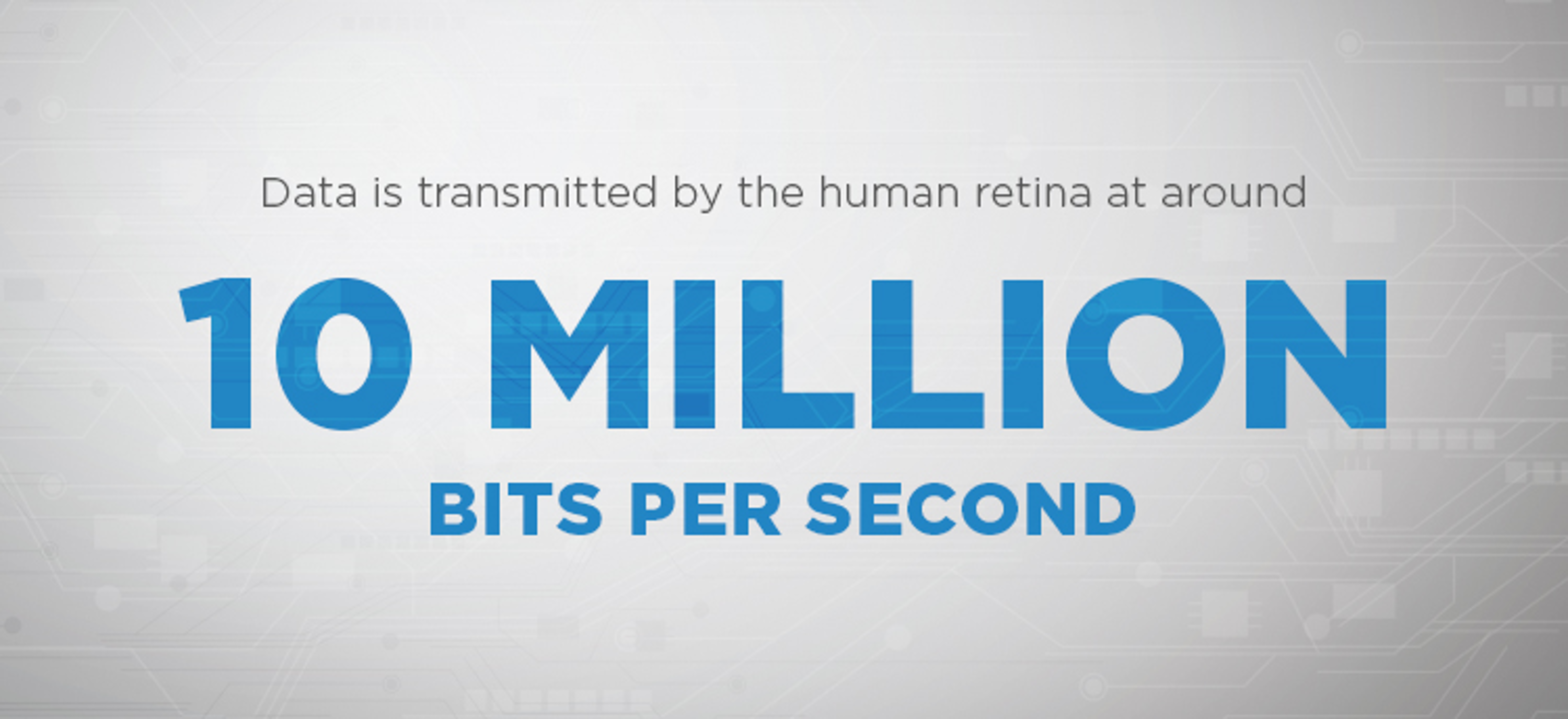
In a 2006 study conducted by researchers at UPenn's School of Medicine, it was found that data is transmitted by the human retina at around 10 million bits per second, which is roughly the speed of an Ethernet cable connection. For decades, however, business reports have generally failed to present info in ways that can be harnessed at the speed of sight, simply because traditional charts and tables don't arrange data in a clear yet nuanced manner. Consequently, time that could be spent putting knowledge into action is instead spent trying to piece information together.
Data visualization, by contrast, makes it possible for business analysts to instantaneously see multiple dimensions of information and how it all interrelates. With some of the more complex graphical tools such as fever charts and heat maps, data visualization has helped redefine how data is interpreted by professional decision makers. As such, companies that utilize visual data in reports are likelier to gather knowledge instantly on key topics and ultimately gain an edge on their competitors.
In fact, studies into the effects of data visualization have proven time and again that the tools greatly boost efficiency in the business world. In a 2013 study conducted by Aberdeen Group, it was found that people in managerial roles are 28 percent likelier to gather information in a timelier manner than people who resort to older methods of reporting. The stats are even more impressive among companies that employ the process of business intelligence, 48 percent of which gather vital data and turn those insights into action without the involvement of IT staff in the majority of cases.
2. Improved, simplified focus on what matters most. The combination of visualizations and contextual info allows analysts to see everything at once and instantly zero in on the most important details. Effectively, data becomes simplified because everything is simultaneously presented, but the key facts take center stage. As businesses grow more competitive with each passing year, the most crucial facets of any operation will generally involve the correlation between market performance and operating conditions.
For a hypothetical case in point, analysts for a computer supplies chain could examine a monthly report on nationwide customer stats. The report might contain a standard bar chart that shows dissatisfactory net promoter numbers throughout the Deep South, which would mean that customers in that region have not been recommending the chain's products to other people. Though this would indicate that the chain is lagging in customer satisfaction below the Mason–Dixon line, the report would not give any indication as to why this is the case.
On the other hand, a nuanced report with data visualization could reveal that customer relations have cooled down South because a custom-service call center in that region has not been yielding high resolution rates on initial contact, which has ultimately led to negative word-of-mouth among customers in that region. With that crucial piece of knowledge, which would show exactly how conditions have impacted performance, executives for the chain could then take action and remedy the situation.
3. Easier viewing of trends and patterns. Traditional data formats have often been notorious for making it difficult to distinguish patterns within large bodies of information. In a given document, there could be so many lines of flat text with key info scattered about from paragraph to paragraph that it could take hours of reading, highlighting, and sorting just to cull the most important details. When visualization tools are incorporated, however, the most important details are brought immediately to the fore — no wasted time mining for stats, figures, or other key essentials. Simply put, it's far easier to understand trends and patterns when they're laid out in charts, maps, and trees, and when they’re represented with varying types of graphics.
For example, executives for an expanding restaurant and catering chain could examine a report in which data visualization effectively highlights the fact that most profits in urban areas over the past 12 months have been generated from takeout orders, rather than diners. With that information, the executives could then decide whether to focus urban expansion more in the catering realm, and limit the larger sit-down locations to suburban markets.
4. Ability to modify and interrelate with data. Perhaps the foremost benefit of data visualization is the way that it presents actionable ideas in ways that can be easily understood by all interested parties. Whereas traditional charts and graphs are merely meant to be viewed, analysts can interact with data when the modern tools of visualization are at hand.
For example, a fashion marketer could send out an Excel spreadsheet to inform apparel manufacturers that denim sales are down in the major urban markets, but it won't give any additional information to put things into context. Thus, such a report might only prompt further questions among the manufacturers, such as whether the sales drop has to do with climate change in certain areas, or economic factors that might be impacting the sale of jeans, or whether consumers are now demanding different lengths or cuts than they had been a year beforehand. Furthermore, the info presented could even be a month or more out of date, and ultimately not be a reflection of the current week's denim sales.
If, on the other hand, a report utilizes tools such as predictive analytics and real- time visualization, manufacturers could see updated sales figures in any given market. Additionally, the report would now show why sales have dipped in certain cities, whether it's due to new denim lasting longer or some emerging street trend towards worn, tattered, and frayed denim looks.
From there, jean makers could decide how to remedy the sales slump. For example, if sales of low-waisted flared jeans are down in New York and Los Angeles because most people own several pairs already and are now getting tired of that look, jean makers might consider shipping high-waisted drainpipe jeans to apparel outlets in those markets. Alternately, they might look to the streets of Milan or Paris to see whether a radical new look or silhouette has taken hold among the more fashion forward crowds in Europe.
5. Ability to develop a new language for business. One of the most unique things about data visualization is that it tells stories through image representation, as opposed to merely presenting static facts.
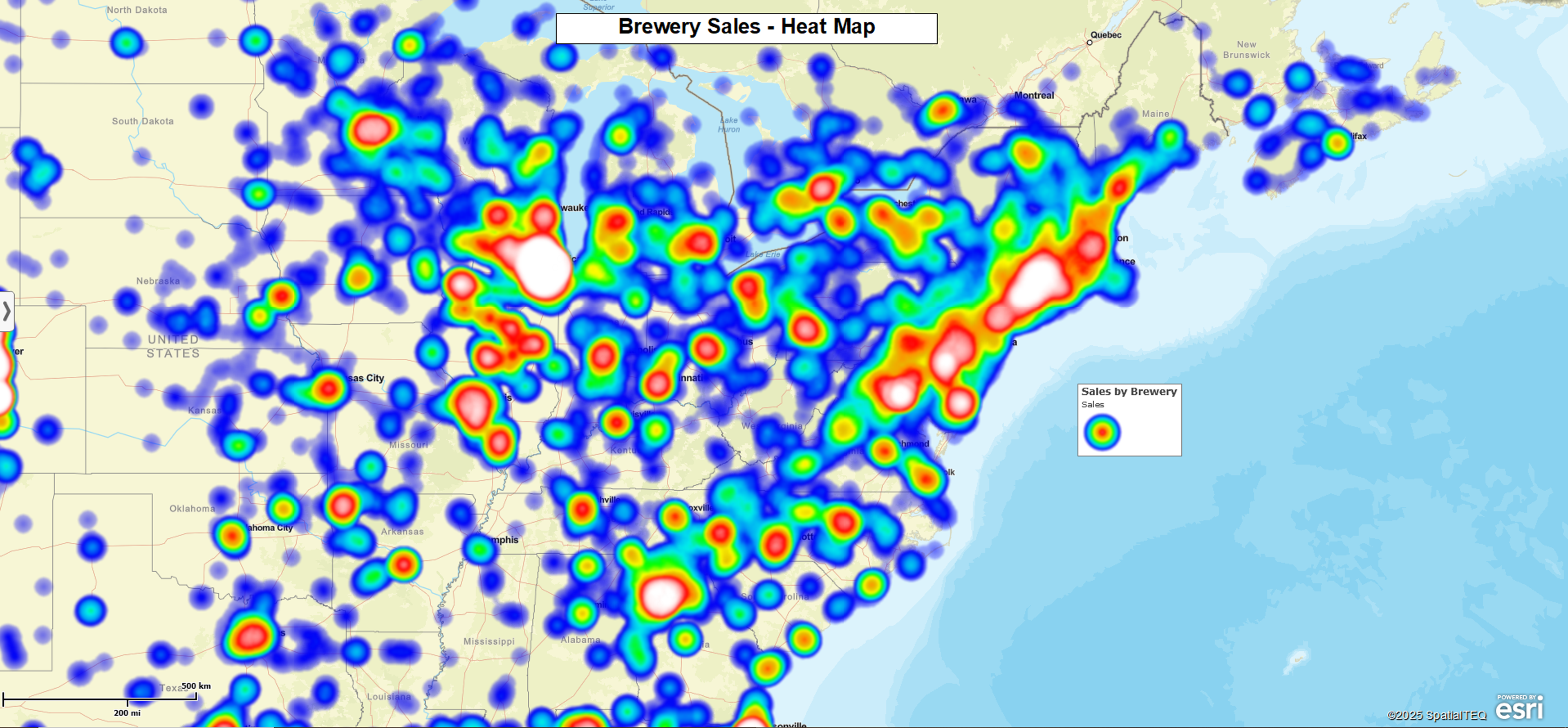
An example of stories being conveyed through visualization could be in the form of a heat map, which would show a lot more detail about revenue growth for a particular company across the United States. In an older format, such as a static bar chart, there wouldn't be any details to show how figures vary on a city by city, state by state basis. It would only show whether overall figures are going up or down.
In a report on earnings before interest, taxes, depreciation, and amortization, a heat map could offer volumes of insight into how products are performing in certain markets. For example, a company that sells furniture nationwide might receive a report that shows that earnings are low throughout most of the U.S., but that earnings are exponential in the most prosperous zip codes. Therefore, sales are actually healthy because furniture items are moving by the truckload in the richest areas, and all of this business makes up for the lack of sales in poorer and less populated areas.
In this regard, data visualization offers a much more nuanced picture of how things are performing overall, whereas a conventional report might only indicate that sales are low in most markets, which would incorrectly imply that business is weak. Based on the info at hand, the furniture company could decide upon any number of actions to either boost sales in slower areas, or simply maximize profits in the booming centers. In the less prosperous markets, they might consider lowering prices on individual items, or bundling items at the price of one.
6. Improved collaboration among work teams. Data visualization makes it easier to collaborate because key info across all areas of a study are presented with equal clarity. As such, the unique skills of each member on a working team are brought to the fore. With everyone up to speed on a given project, decisions can be made and implemented faster than in situations where certain areas of data are presented more clearly than others. With proper visualization tools, you don't have situations where a few of the analysts receive their info upfront and others have to sift through tons of text. Everyone learns what they need to know within seconds.
In short, data visualization makes it easier to gain vital information, identify trends, collaborate at a likeminded pace, and from there put decisions to action — all with much greater speed than is generally allowed by presentations that lack the proper visual tools.
The Shortage of Analytics Skills
One sector that has recently benefited from data visualization is the hospitality industry, which covers a spectrum of service-based businesses ranging from theme parks and vacation resorts to event-planning companies and transportation services. Much of this boils down to the fact that modern visual tools make analytics more accessible, which facilitates a better working environment of strategic analytics.
Traditionally, companies within the hospitality sector have been short-handed in the area of analytics. Given the overall growing demand for analytics the pressure has been on for hospitality organizations to find ways to meet this problem head on. The answer to this problem, of course, is data visualization, which combines information with visual tools in a simplified manner that allows people at all levels of technical skill to understand the most advanced forms of analysis.
Once an organization has implemented the proper visualization tools, the vast majority of people across all departments will eagerly adopt and maximize this newfound power of analytics. While this is happening, analysts will also be able to direct their energy toward answering the most pressing questions that are presented through analytics, as opposed to simply arranging and reporting on information. Nonetheless, the visualization tools that are used to make this happen will need to be appropriate and effective in order to convey the nuances of each body of data.
Only with these tools at hand will analysts have the drill-down and exploration capabilities necessary to satisfy the demands of tomorrow's hospitality market, where the ability to answer questions on a full spectrum of issues will be needed like never before.
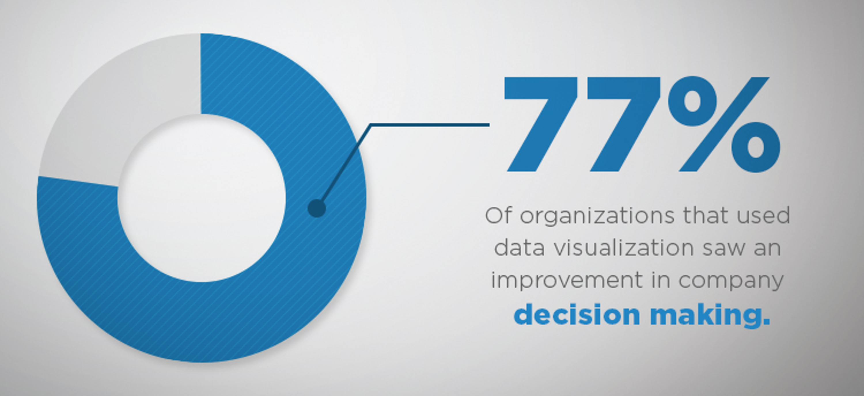
When analysts draw quicker insights, the impact on productivity is positive to say the least. According to a 2013 McKinsey article on the topic, a company that incorporates analytics and data deep within its infrastructure can expect a profit and productivity advantage of five or six percent over competing companies. Furthermore, a recent survey conducted between SAS, CIO Marketplace, and IDG Research found that organizations have the following impressions of data visualization:
- 77 percent saw an improvement in company decision making
- 45 percent cited improved skills among analysts on the topic of ad-hoc data
- 44 percent saw enhanced collaborative skills among working teams
With data visualization, organizations of all types are not only able to make decisions faster — they're also able to work better together as groups.
Ways Business Mapping Contributes to Effective Decision Making
One of the greatest innovations of data visualization is business mapping, which allows company executives to analyze marketing info on a geographic basis and from there craft new initiatives based on location awareness. The tools provided through business mapping allow executives and work teams to study trends from numerous variables, including the following:
Data point labeling options. Business mapping allows viewers to see multiple callouts at once, all of which can be modified and customized to enhance the data visualization message.
Chart illustration. Map point labels can be graphically enhanced to indicate the value of location data like fulfilled orders throughout an area of service or sales values over a 3-year period. With bar or pie charts, imported numeric data columns can be displayed for instant comparison.
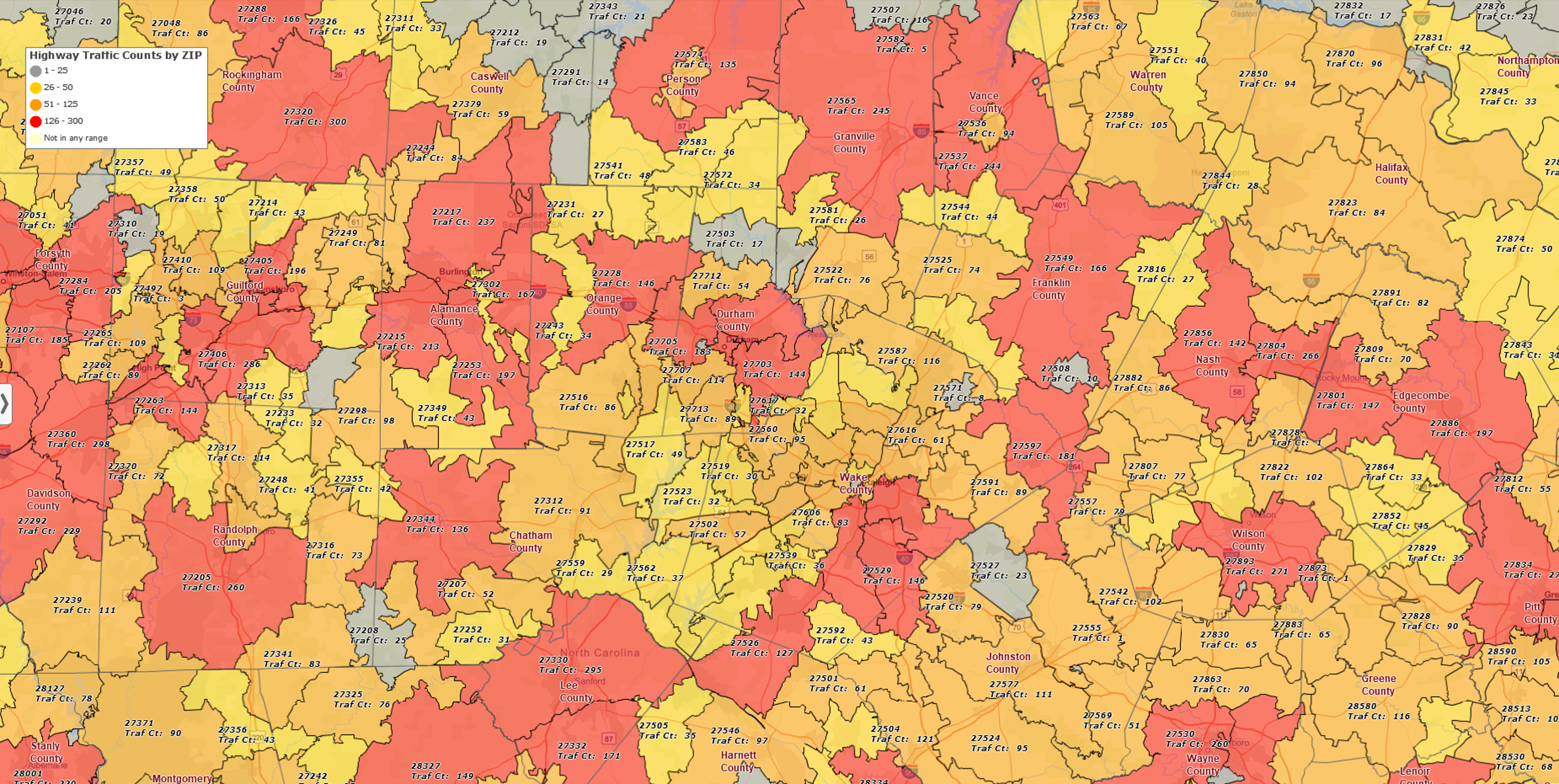
Color coding. When it comes to images, the use of opposing colors is the most effective way to invoke contrast to the naked eye. With business mapping, color coding can be employed to distinguish areas by county, ZIP code, state, or region. This provides an easier way to analyze marketing trends geographically, and in turn make better-targeted business decisions. Points can be color coded too, to quickly define categories in user imported data.
Customer routing. Map routing tools help identify route directions to customers in any given locale. Determine how long it takes to get to the nearest location from a particular address, and map out all the optimized and quickest routes — all of which can generate more efficient travel times, increasing the number of visits and sales from happy customers.
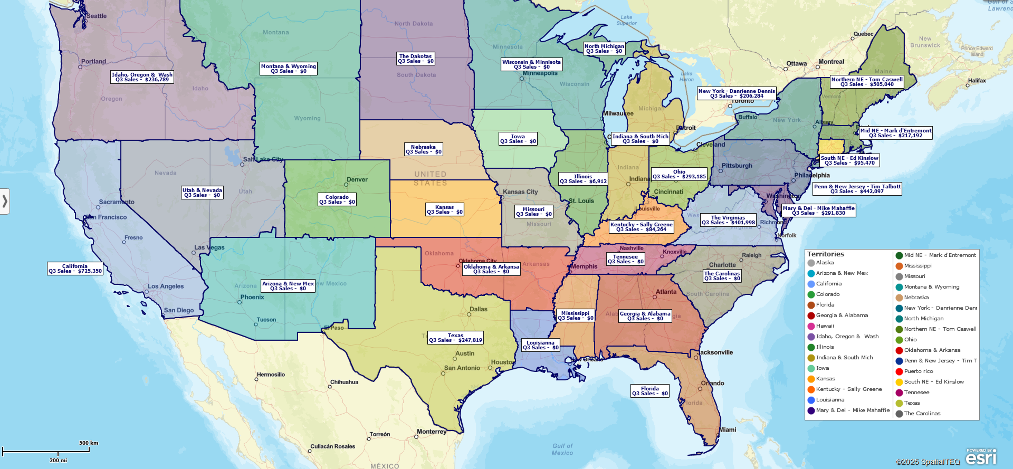
Customized graphics. Business mapping allows you to draw various shapes and lines around different market areas of interest to create business sales territories. These defined areas of interest can be color coded, and associated with critical business and demographic data.
Demographic data. With any type of business, it's crucial to gather as much info as possible about each relevant market demographic. Business mapping aggregates such data according to drive time, locale, and other variables. Based on this info, you can positively identify the most profitable customer segments, suggesting potential targets that you've thus far failed to reach. This classic data visualization exercise can help you make decisions around market expansions – new stores, additional sales people or marketing and sales campaigns.
Fast mapping. Today's more advanced map visualizations allow you to organize info by city, street, ZIP code, and latitude and longitude coordinates. Web- based mapping tools enable rapid map construction complete with imported user data, mapping and color coding 250,000 or more points in just a few minutes.
Flexible viewing. Records can be searched, sorted, and filtered by customer account, business name, territory and geographic area of interest. Search results can be viewed on the map or exported for use outside the data visualization map application.
Heat mapping. Trying to determine whether a market is cold, warm, or burning red? Heat mapping will give each jurisdiction a color code with such precision that it becomes easy to see exactly which cities, counties, and ZIP codes are generating the strongest sales. From there, you can determine what could be different demographically, economically, or access-wise from areas where sales are moderate to slow. Heat mapping is a great way to enhance data visualizations because the map view is similar to a tornado warning map; audiences tend to pay attention.
International mapping. Business mapping covers a whole lot more than the United States. If you court international customers, or operate locations abroad, it's important to have data maps that are specific to each region within your global market. With combined or separate maps for the markets of Canada, data can be generated more efficiently on the local demographics and sales trends, all of which can lead to more fluid growth within these potentially lucrative territories.
Map embedding. Another great function of business maps is embedding, which makes reports more effective by adding a geographic visual component that drives home the message. map image views tend to bring viewers to rapid consensus, which leads to actions and results. Map image files can be embedded in documents, PDF files or in Power point presentations for wall projection.
Map layering. Markets can be drawn up and analyzed according to trends within geographic areas. With business mapping, the user has many options for geographic boundary layers, these layer options allow you to split the same map into multiple uses. For instance, regional state or county boundaries can be used for general market definitions, while zip codes, Census tracts, MSAs could be applied to create individual territories.
Map printing. Maps can be saved as PDF files for large printouts, which can then be used during presentations. The option works on home printers, on which a larger map can be printed page by page or on plotter printers for a single sheet, 60" x 60" printout. Once your people see positive sales trends as color coded data visualizations on a large map, they'll be more convinced about your strategic plan.
Map sharing. Maps can also be shared with business colleagues, traders, suppliers, shippers, vendors, and customers, whether local, out of state, or abroad. Interactive business web maps can be saved as JPGs, PNGs, or PDF files for export, email, or use in presentation Microsoft documents such as PowerPoint.
Market-area analysis. With business mapping, data can be retrieved on any given number of locations. This allows businesses to create location-specific profiles, determine the geographic distances between storefronts and wholesale warehouses, and decide which areas are most ideally situated for increased sales and expansion.
Radius searching. Think of a business map as a visual search engine of geographic marketing data. By performing a radius search, you can gather data on sales, customers, or demographics within a particular radius, all of which can be used to create marketing campaigns. Once gathered, the information can be exported to spreadsheets and distributed among colleagues and vendors.
Sharable editing. Maps can be edited individually or collectively among co-editing teams. With sharable editing, pools of insight can be drawn together among teams when analyzing info on a region-by-region basis. By encouraging team participation, sharable editing leads to better communication among team members, faster problem solving, which in turn generates faster and more insightful decision making.
State/regional views. Does your business only cover one particular state, region, or group of states? If so, you use business mapping to filter out the parts of the nation that you don't require and create maps that focus data visualizations on critical areas that contain your storefronts and customer base.
Symbol placement. A key business mapping feature supporting data visualizations is the use of symbols, which can vary in image, size and color. Whether customized or selected from any given number of canned options, symbols define the market highlights and major opportunities across a business map, from customers and hotspots to storefronts and affluent areas of interest.
Territory mapping. With business mapping software, marketing and sales territories can be organized by state, county, or ZIP code. Easily create and maintain these data visualizations of sales territories that drive accountability into your organization. Business mapping data visualizations of sales territories enable accurate and fast sales data aggregation which quickly communicate results and generate strategic and tactical discussion that inform sales planning.
Making Business Decisions Is Easier With Mapping Software
Business data visualization tools are essential for any person or company that wishes to stay competitive in today's increasingly tech-savvy marketplace. MapBusinessOnline offers a full range of cloud-based business mapping tools for companies large and small throughout the U.S. and Canada.


