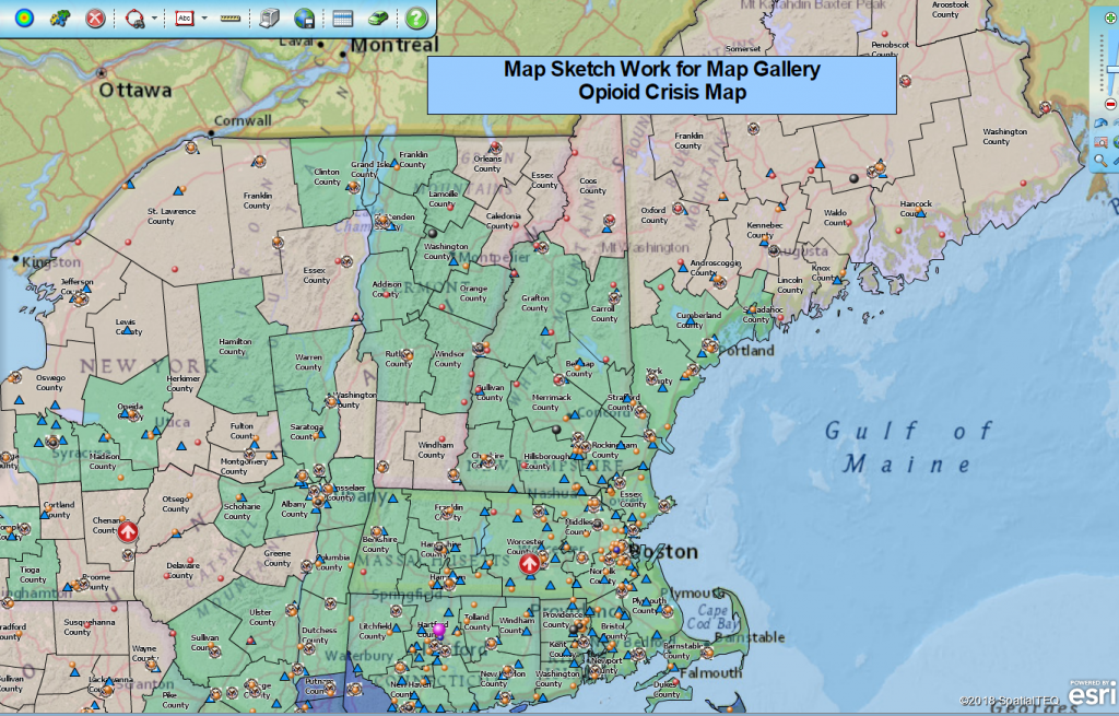
The Map Business Online Map Gallery
Business mapping software is used to solve problems, define business areas of interest, and to assign areas of responsibility. Business maps are also used to present strategic plans based on geography. A business map might also be used to describe competitors or to outline business expansions plans.
However you use business mapping software, the map you make is your creation. As such, it is a subjective work reflecting your style and approach to mapping the particular issue at hand. You will choose the look and feel of the business map based on your understanding of your business, the map’s intended purpose, and the company’s preferred presentation styles.
Map Business Online is your palette as well as your brush and paint source if you don’t mind the painting analogy. You will use this set of tools, included in your business mapping software, to create a map that meets your map objective. This means you will spend a good amount of time developing a map style as you go through your map process. Keep this in mind as your work progresses.
Certain aspects of your map are what they are. You may have very little control over the data you import. And your boss may specify that she wants to see the map as a heat map. In these cases, you will do your best to meet their requirements, while keeping in mind that their guidance may, in fact, be contrary to the development of an effective map. You may need to take liberties with their direction but certainly explore their requirements first.
Your Business Data Imports
Consolidate like datasets where you can for map clarity. For instance, don’t import one dataset of customer locations and another dataset of customer-sales, also by location. Consolidate these two very similar datasets for map efficiency and, more importantly, for map viewer simplification. Always seek KISS – Keep It Simple, Stupid. Simple beats complex in maps and in presentations.
Use the map application to rename odd-ball database names so the naming conventions add value to your map. Don’t confuse people with file names, enlighten them with succinct descriptive phrases.
Select symbols that are business-like and unobtrusive. Don’t distract from your business intention by trying to display clever symbols. However, do import logos or symbols that imply obvious data relationships – as long as that relationship or business is critical to your map’s business intent. For example, don’t use an “organic” company logo to be hip or impress the new vegan guy, use it because the presentation you are giving demonstrates the proliferation of organic food suppliers over the last ten years. Forget about the vegan guy.
Color Shading Map Layers
Use imported data or demographic data to color shade map layers. In general, map layer color shading, which some refer to as heat mapping, should underscore a major point your making in a map presentation.
I tend to use point layers or heat map layers to make major map statements. Color-coded ZIP codes or counties usually support my statement with relevant and accurate values driving the color fill.
However, I would use a map layer for my map statement if the map layer was part of that statement. For instance, if the map purpose was to show the increase of murder rates by ZIP code across an area, well then, use the ZIP code layer to describe your point. Especially, if the murder rate is for vegan’s only. (More senseless vegan humor.)
Your Map’s Look and Feel
Business maps reflect your style and your company’s culture. When choosing symbols, an understated map stylist will choose circles and triangles, as opposed to icons. The less obtrusive symbols will not distract from your map statement. They may instead lend a sense of professionalism to your map work.
That said, using a building icon or an airplane icon to represent facilities on your map may be the most effective way to reference infrastructure on your business map. Know your audience. A team of sales executives may be up to their eye-balls in your company’s sales stats, requiring just a label to understand a sales map layer, but they may need a whack upside the head to comprehend “Airports.”
Pastel Colors vs. Bold & Bright
I prefer the Map Business Online National Geographic background map for its mellower colors. The satellite background map is also appropriate at times for its dark hues. These darker shades can sometimes highlight dot density maps better than a street-level detail map background might. Try different background maps.
I believe color shading should not use bright colors unless the map is deliberately trying to get people’s attention. For general business maps, I seek pastel colors, softer shades that are easy-on-the-eyes. For emergency meetings addressing surprise concerns, I might go with bright and bold colors, with sharp and thicker border colors. All tweak-able within the Map Business Online Map & Data controls.
As always, these decisions are personal choices. My main point in bringing all this to your attention is to make you aware that with Map Business Online, you have a tool that gives you options for how you approach your map work. Develop a style that suits your business, helps accentuate your map statement, and makes you look like a competent professional in the process. Regardless of your stance on veganism.
I’ll be digging into subjective mapping more on our webinar tomorrow, at 11:00 AM EST – webinar registration.
Win a $20 Gift Card! Refer a business associate to Map Business Online in exchange for a $20 Amazon Gift Card!
Find out why over 25,000 business users log into www.MapBusinessOnline.com for their business mapping software and advanced sales territory mapping solution. The best replacement for Microsoft MapPoint happens to be the most affordable.
Contact: Geoffrey Ives geoffives@spatialteq.com or Jason Henderson jhenderson@spatialteq.com

