We interrupt our regularly scheduled blog to bring you this special blog presentation. I had another blog drafted, but I felt this one was more appropriate for our shared historical moment. Some of our clients may want to build maps using Covid-19 publicly available data.
Mapping deaths by state isn’t the most uplifting of map subjects and for that I apologize. But this is the world we live for the time being and all of us are watching the numbers unfold, day-by-day.
MapBusinessOnline supports the ability to import Novel Coronavirus data into the application and then use the business mapping software to display both confirmed cases and the number of deaths by state and or county. As with any process, it takes some patience and careful assessment. There are quite a few decisions to make when creating an effective business map.
- Find the Data
You may be fortunate enough to have access to a Covid-19 data source through your business. My government contacts are limited to the occasional rant-email to Senator Collins. Maybe I should say “restricted,” not so much limited. At any rate, I was forced to conduct a Google search to find reliable and updated Covid-19 data.
CDC has a lot of information, but I was not successful in uncovering raw location data for Covid cases and deaths. I found a data source at USAFact.org. Here’s the link if you are interested. The data is updated daily.
I recommend reviewing any dataset you plan to map before you begin creating the map. Explore its geographic extent and decide which map layer makes the most sense for presentation. Make sure you understand all the column headings. To be clear, there is one dataset for confirmed Covid cases and another dataset for deaths. It took me a while to realize this data was presenting a summary of cases and deaths for each day posted. That is, if I used the most recent column in time, I would be accessing the total number of cases or deaths to date in each County. So no further summaries are required. Really helpful once you realize it.
- Import the Data into MapBusinessOnline
With the data downloaded to your desktop and saved in a place where it is easily retrievable (yes, sometimes we save it in a not so easily retrievable spot, eh Microsoft Onedrive?) import the data into MapBusinessOnline using the Plot Data button. Read about importing data.
This data came in wicked easy. It was all County data and plotted well. Quite a few counties had dots indicating Covid activity, which made sense based on what I’ve seen on the news and read online. Always review your imported data to verify correctness. I then Unchecked the data in Map and Data to remove the visualization of the data points. I don’t need points. I want to color-code counties and states by disease data to create a contagion map.
Let’s start with color-coding the State map layer by Covid-19 deaths. For me, understanding the number of deaths per state or county seemed like the most important measure of where we are with this thing. Here’s the color-code process:
- Click the Three Puzzle Piece button to color code counties or states by the imported Covid data
- Choose the State Map layer as you move through the dialogue pages
- Now Choose your imported Data (Covid-Deaths) and
- Choose the column in the data that presents the sum of deaths by the date.
This final dialogue page is where the magic happens. It requires some decision making. The color-code dialogue needs you to decide how the state layer should be colored to best display the imported data. You’ll need to decide on at least three things:
-
- The number of color groups you want to set up – I chose 5
- The color scheme for your range of data – I inserted my own color choice for each color group. Red is the high number and then orange and yellow gradations
- The numeric break down between color groups. Start with 1 -10. Then move to 11-25, all the way up to 101 – 157 (the top number of deaths in a state)
- Now you can choose a fill color for states with zero deaths, or choose to not include zero states. I chose a bland light gray fill color – not distracting, not too bright.
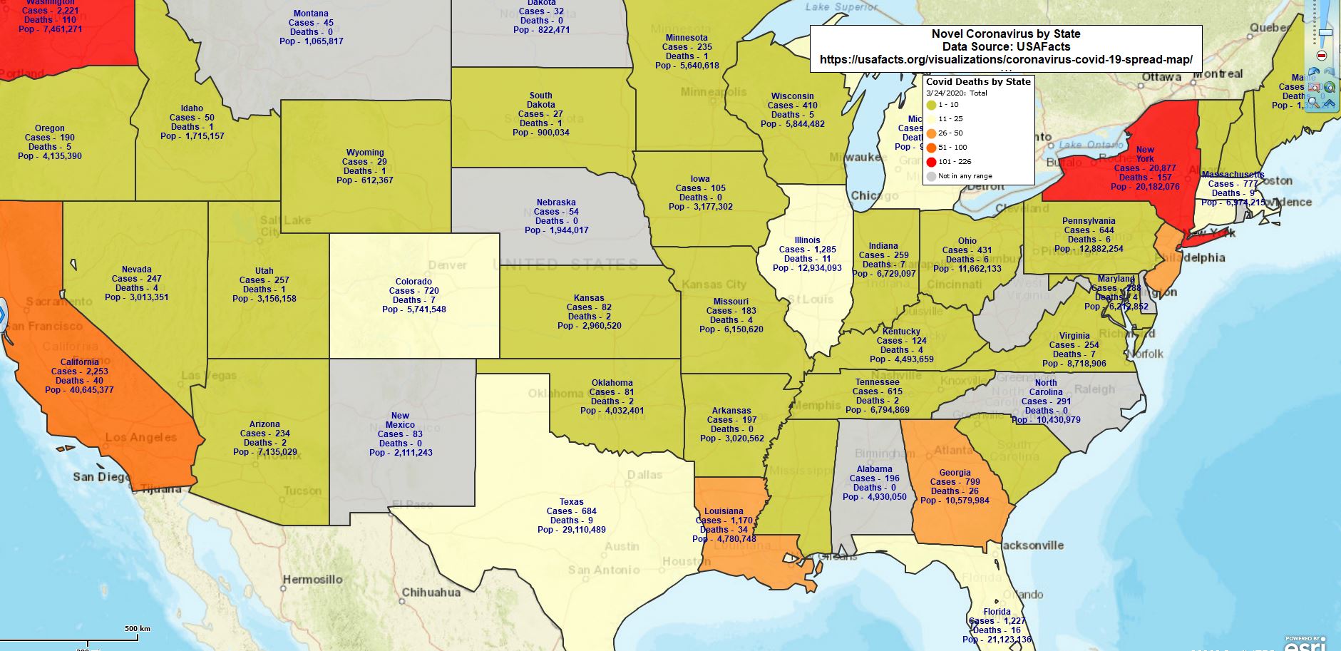
Covid-19 Deaths by State
Next, you can either preview the look of the map, or just process the map view. Either way, it’s easy to tweak the settings again. Generally, color choices take some time to settle in the map creator’s mind. In between tweaks, go to the State Layer in Map and Data and adjust the settings on these, look and feel items:
- Set a nice dark boundary around each state.
- Set the transparency scrollbar to a comfortable level – I went with 20%. Covid maps aren’t about background maps, but some background adds orientation to the map
- Lastly, click into the Label Tab and adjust the Auto Label settings to give your label text the right feel. I like dark purple text with no shadow, normal size, and no italics. But that’s me
- Select Pertinent Label Data
MapBusinessOnline allows the addition of up to five flexible fields with your Map Layer auto-label – the State label in this case. While you’re in the label section of the State Layer, decide what elements of your imported, and/or demographic data, you’d like to include in the label flex fields. I chose:
- Cases – per state from the imported data
- Deaths – per state from the imported data
- Total population per state – from MapBusinessOnline demographic data
In the Label Tab, select Format Label, and Auto Label. Scroll down to see the Flex Field options. Dropdown first to select your data, then again to select your column. Insert a little text in the Prefix field to give your data some context. Your prefix might read “Cases –” and on the map, it will show: Cases – 150.
Update: I updated this Covid-19 map with new data this morning. This was a manual process that took about five minutes. My link pasted in here, is a Publicly Shared Map published through the shared map dialogue (4th button from left). Our Map Gallery version (not published yet) will be updated automatically using our data SDK. Once the link is shared the map viewer simply refreshes the webpage. Here’s the link!
With all those decisions made, you can now go view your map. Double-check your work:
- Make sure you selected the right data for the right view (states in this case) and the right column of data. This means checking a State to see if the number listed is correct
- Look at the coloring of the states. Does it make sense? Are they all there as expected?
- How do you feel about the colors, do they display in a way that looks and feels easy to view? Or are they loud and obnoxious? Tweak them as necessary
- You probably know your state’s numbers for today. Check the map data and see if it matches. Of course, you may not have the most recent number now, but it should be close
5. Adjust the Map Legend
Finally, look at the editable Map Legend and tweak it by clicking the tiny Edit gear in its upper-right corner. The Map Legend explains your layers to the map viewer. Within the MapBusinessOnline legend, you can consolidate text, overwrite text. You can uncheck map layers you don’t want to include in the legend. Go at it. Make that legend speak to your primary map objective.
Now, review the map and tweak as required. Adjust colors, transparency, text settings, and the map legend. Tweaking is a big part of creating an excellent map.
Here’s a bonus idea. You can take the point layer of either the cases or deaths data (or other data you find) and symbolize it using the Graph option, eleven buttons in from the left, Put Charts on Map. Charts work well for Covid because you can show three to six day changes. I used Covid Death data.
- Choose to filter the data by Map layer – I chose the State layer
- Select your target data
- Select the Chart type
- Select three or more of the Date columns – I chose 3/22, 3/23, and 3/24
- Adjust the chart intensity bar – I chose 250% to make the graphs meaningful at a national level
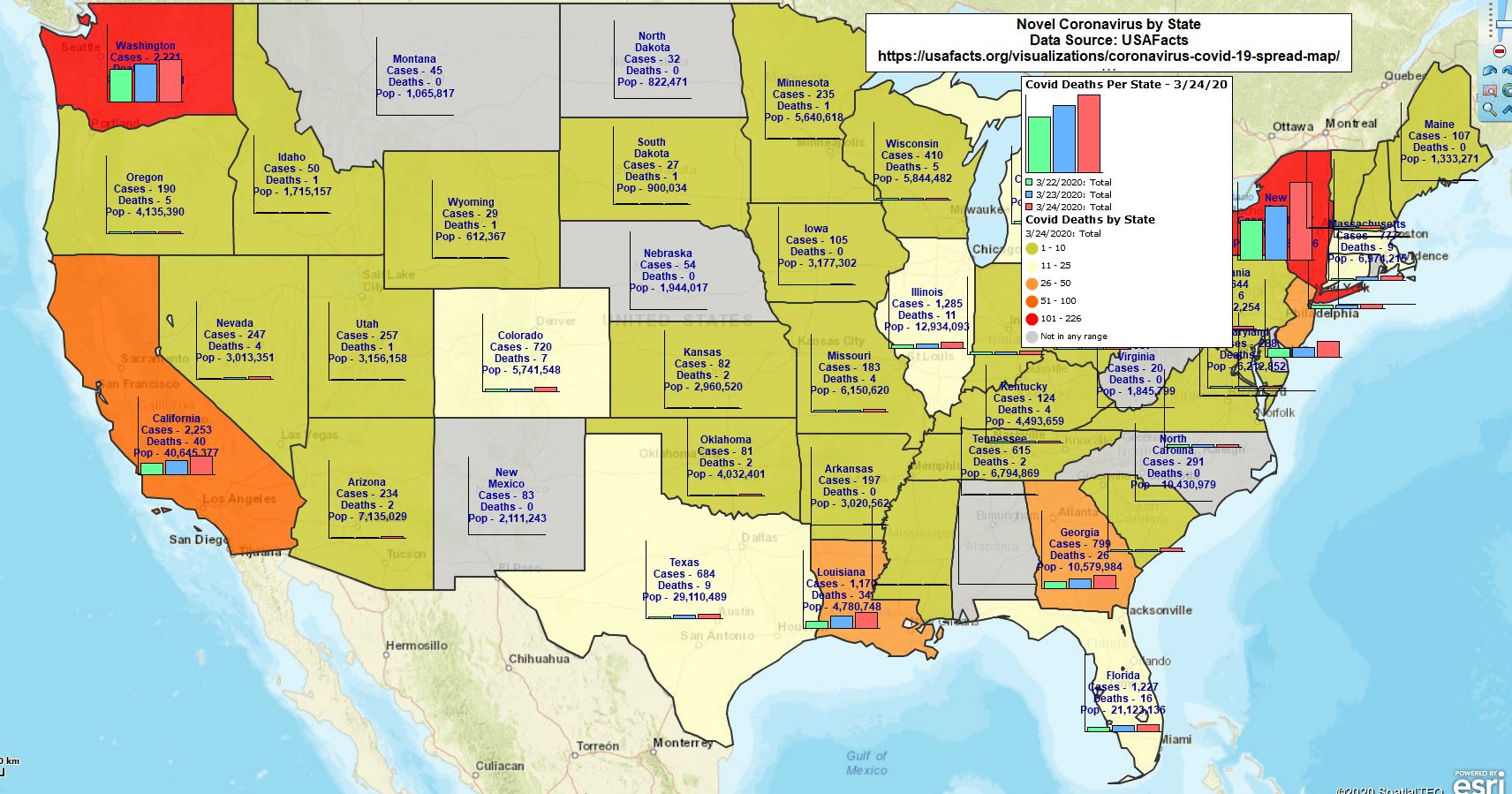
Covid-19 with Chart Symbol
Let’s hope our time tracking the Covid-19 contagion is brief. All of us here at MapBusinessOnline hope you and your families remain safe and untouched by this horrid disease. We’ll get out of this eventually by following the advise of experts and working together for a safe recovery.
______________________________
Are you using the MapBusinessOnline Desktop App for MAC or PC? It’s hipper than Instagram and it comes with your subscription. Impeach Adobe Flash Player!
Value-Added Resellers – Offer the tool to your customers as a reseller. Make money on training and consulting. Contact us with further interest in reselling MapBusinessOnline.
Win a $20 Gift Card! Refer a business associate to MapBusinessOnline in exchange for a $20 Amazon Gift Card!