Thematic maps are a common application of MapBusinessOnline. The business mapping software ingests a dataset of location points by address and selects a numeric column of data to color-shade a map layer such as ZIP codes or Counties. The numeric columns of data become the thematic coloring element for the map. The map viewer can quickly associate color-shaded ZIP codes or Counties with specific data trends complimenting the map’s intent.
Examples of data-appropriate thematic coloring columns are:
- Monthly sales totals by account address.
- Residential home values.
- Hospital pandemic case counts.
- Population by County map using demographic data
- Median Income vs. homeless shelters by ZIP code
The data noted above is used to develop a data-based theme on a business map. Additional map layers are added to contribute to the overall value of the map project.
Read more about color-coding map layers:
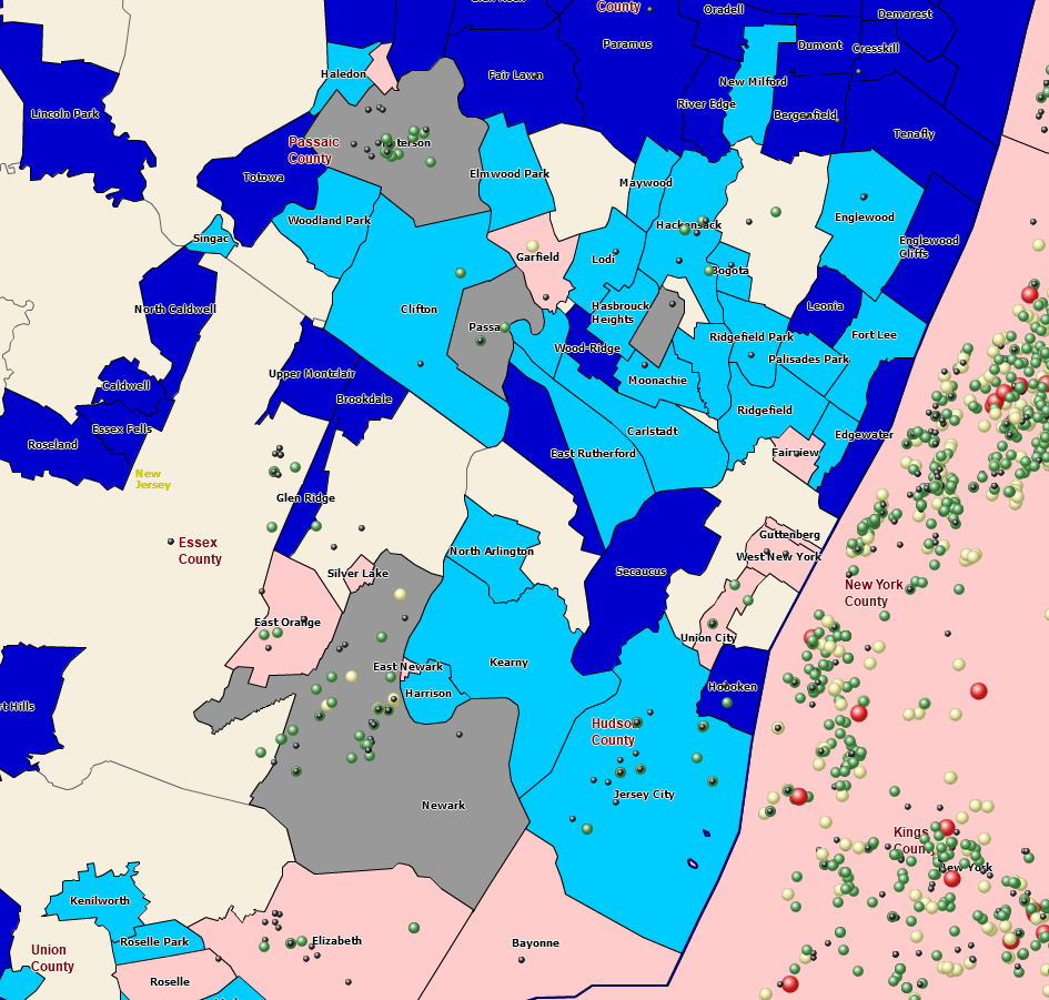
Generally, thematic maps utilize the ability to color-code map layers, such as ZIP codes or counties, based on a column of data. But you could also color-code or size-adjust map symbols associated with address points on the map. Map visualizations can include a variety of map layers and color-coded schemes as long as the data presented is relevant and correlated. Random map layers can distract map viewers. Relevant data is critical to a successful business map project.
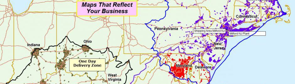
Thematic Maps Come in Many Shapes, Colors, and Sizes.
I mention this because I’ve found business mapping customers sometimes use one business map as a catch-all scratch pad for business issues. A designated map creator might start with a map of customers. Sales territory mapping soon follows. The next thing you know, vendor addresses are on the map, followed by hospitals, airports, and zoos. Pretty soon, the map is useless to all but a few ‘in the know’ map viewers.
Build Template Maps
A great way to avoid this cluttered map problem and maintain your original scratch map is to save all map work as a Map Template. When you click the Save Map button on the MapBusinessOnline Master Toolbar, you have two options for saving map views.
- My Map
- My Template.
Please get in the habit of saving My Map templates. The user opens their map project, adds more layers, and saves that new configuration as a My Map. You’ll always have that saved and worked-up template map – a worksheet, a territory map, or a base thematic map.
Tip: When creating or editing a map, you always have the option of saving the map you’re working on under a new name, thereby creating a new project. It sounds simple enough; remember to do it for work that matters.
Read more about map templates here.
Color-Code by Circle Layer
Point layers are imported business data from spreadsheets. Usually, an Excel Spreadsheet is overlayed onto the map as a point layer. These location data points are symbolized and color-coded using a column of numeric data. MapBusinessOnline provides four options for displaying point data layers, all listed under the Color-Coding section on the MasterToolbar:
- Color-coded Points using the Symbols button.
- Color-code by Circle using the Circle button. This option includes the ability to display an integer.
- Charts and Graph symbols can be applied.
- Point layers can be converted into a Heat Map layer.
- Boundaries let the user color-code map layers like city limits, counties, and ZIP codes.
Consider these color-coded symbol options carefully when creating your business map. I generally use the Symbols button option. Symbols provide a library of map icons to choose from, but I find the colored dots are the best map visualization option. With Symbols, you can adjust:
- The symbol set itself and import your own symbol sets.
- Symbol color shades – there’s a color box for each symbol.
- Symbol size – increase or decrease the size.
- Numeric ranges are customizable up to 100 ranges.
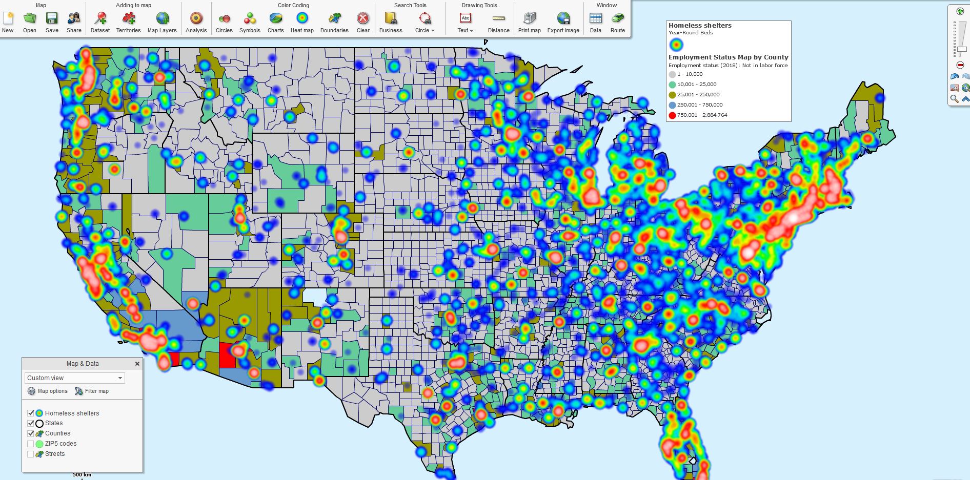
Employed Labor Theme & Homeless Beds Heat Map.
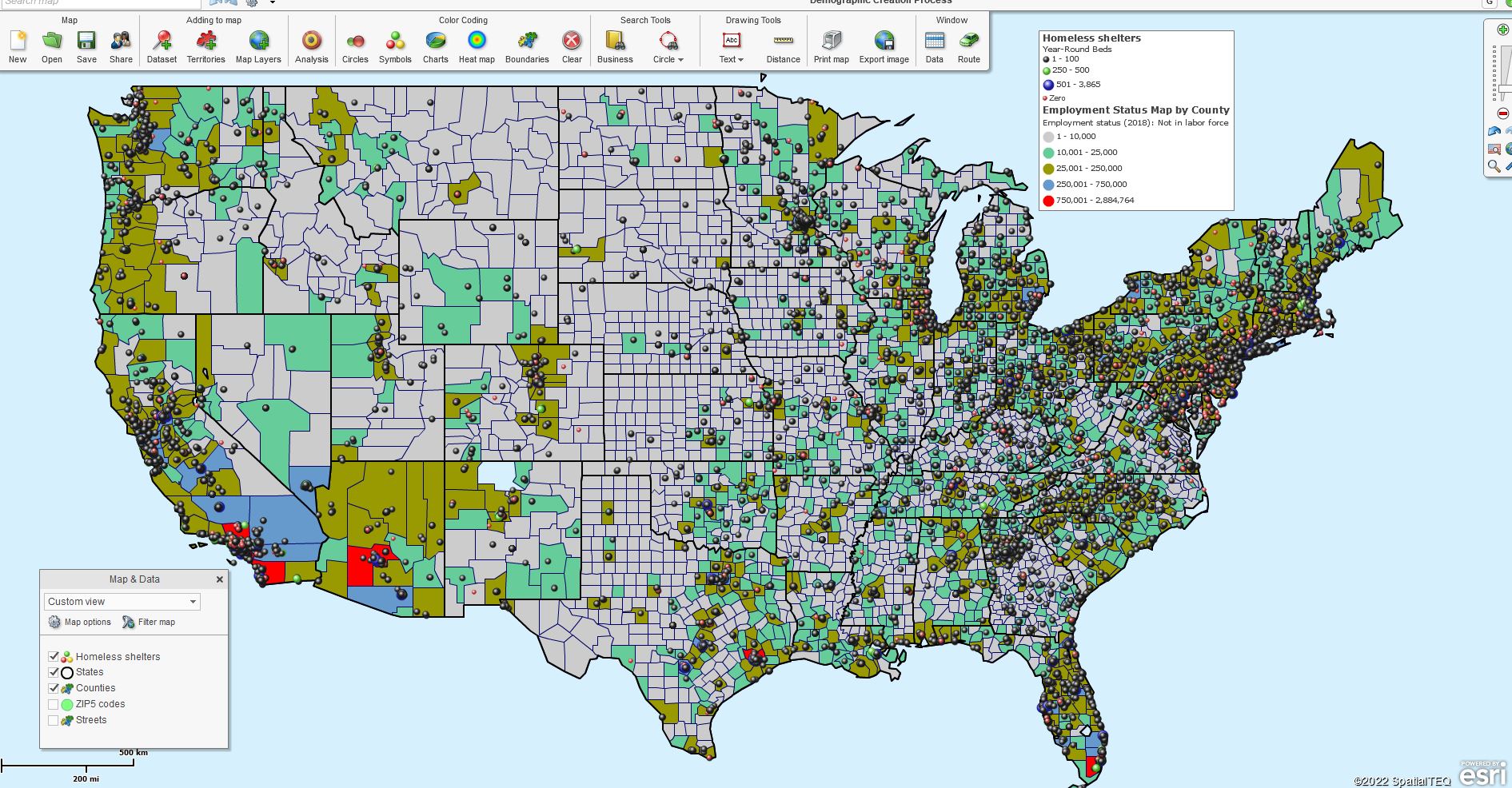
Employed Labor Theme & Homeless Beds Symbols.
Once any symbol scheme is selected, the Map Legend reflects that scheme. Click the small edit gear in the Map Legend’s upper right to adjust the legend lines’ look and feel. All content in the Map Legend is editable. Read more about the Map Legend here.
Color-code by Circle works similarly to Symbols, but you do have some additional options:
- Choose which data later impacts color, size, and label.
- Adjust the circle look and feel – color, border, 3D.
- Choose to show numeric data on the symbol.
Charts and Graphs are handy for comparing year-over-year or month-over-month numeric results. So make sure your data reflects systematic comparisons by column before you use charts and graphs.
Add a Heat Map
Sometimes your data begs to reflect intensity on a business map. The MapBusinessOnline heat map button takes the numeric data columns from imported spreadsheets and transforms them into areas of more and less intensity. These weather-map-like overlays provide the map viewer with apparent regions of increased activity.
Heat maps display obvious and critical numeric data. Try out your data target and see if it’s the right fit for your map visualization.
Another heat map function is what we list here as Boundaries. You can click Boundaries to color-code a map layer by your imported data column. Many map users refer to this application as heat mapping. Read more about heat mapping using MapBusinessOnline here.
The options noted above optimize your thematic map; to embellish your map story for your map audience. Other possible visual additions could include:
- Adding a map object like a colored polygon or large radius circle.
- Use the application as a live display or take pictures using the Snippet tool.
- Placing text boxes, map titles, and summary data results on the map – read more here.
Thematic maps are commonly applied to demographic map projects. Demographic data, which is included with MapBusinessOnline subscriptions, make great thematic topics. Use a demographic thematic map as the background for your business data. Thematic maps can be very effective for business projects related to common demographic themes such as population, income, or other topics.
We used thematic mapping during the height of the Pandemic to display COVID -19 cases, deaths, and ultimately vaccination status by state. What fun!
So now, in our post-pandemic world, let’s find even more uplifting things to map about, like climate, international relations, or inflation. When is that passenger ship to Mars leaving?
_______________________________________________
Discover why over 25,000 business users log into www.MapBusinessOnline.com for their business mapping software and advanced sales territory mapping solution. The best replacement for Microsoft MapPoint happens to be the most affordable.
To access MapBusinessOnline, please register and download the Map App from the website – https://www.mapbusinessonline.com/App-Download.aspx.
After installing the Map App, the MapBusinessOnline launch button will be in the Windows Start Menu or Mac Application folder. Find the MapBusinessOnline folder in the Start Menu scrollbar. Click the folder’s dropdown arrow and choose the MapBusinessOnline option.
The Map App includes the Map Viewer app for free non-subscriber map sharing.
Please read customer reviews or review us at Capterra or g2crowd.
Contact: Geoffrey Ives at geoffives@spatialteq.com or Jason Henderson at jhenderson@spatialteq.com.