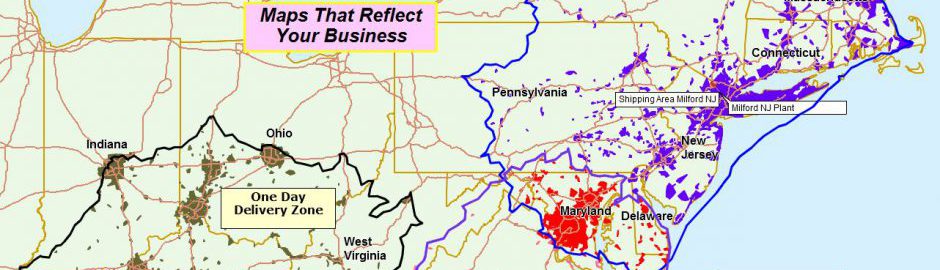
MapBusinessOnline enables the plotting of location data from spreadsheets. Customer addresses, field resource latitude and longitude points, and other critical data are imported and plotted on the map. Once this location data is imported, the business mapping user often symbolizes and color-codes the data to effectively communicate information to map viewers.
I’ve penned multiple articles about the process of geocoding and color-coding imported data. Read more about color coding here. This article discusses additional color-coding options for your imported data.
Summarize by Area
Placing boatloads of data points on a business map can be very effective. For instance, a dot density map can take thousands of location records and display them all as dark-colored dots on the map. This arrangement of data shows where concentrations of data exist. For example, if a national appliance retailer wanted to show where most of their refrigerators were installed, a dot density map would be a great way to communicate that information quickly.
But in some instances, sharing large amounts of data can overwhelm the map viewer. Summarizing the data by ZIP code, county, or other map layers can sometimes be more effective. A map creator should consider summarizing the data in this fashion to see if the approach might be more straightforward for the mp viewer to understand.
MapBusinessOnline keeps its color-coding-by-point capability in the Color-Coding section of the Master Toolbar. Read more here.
- Import your data using the Adding to Map – Dataset buttons. Watch a video outlining the process here.
- Select the Color-coding – Symbols button.
- Select the Dataset you would like to color-code.
- Stop at the ‘Setup Color-coding Step 1 of 2’ and check the Summarize by Map Layer option, and then, in the drop-down, Select a Map Layer to summarize – ZIP code, county, State, etc.
- Proceed to color-coding selection as described in our help documentation.
Summarizing by county, for example, will place only one symbol on the map per county, representing all data of that class in that county. Instead of multiple points for each color, there would be one location point for each classification per County or ZIP code. This can help simplify map views for audiences requiring a big picture without all the details.
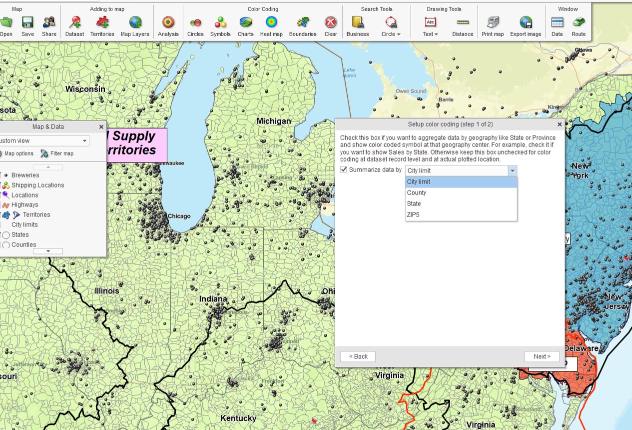
The Summarize by Map Layer Option in the Color-code Dialogue.
Filter Your Data to Highlight Spatial Queries
The MapBusinessOnline Data Window toolbar includes a Filter button. This filter button is the funnel icon on the right side of the Filter & Search section. Wherever filtering is possible in MapBusinessOnline, you will see a funnel icon. Map and Data includes one in the top menu bar for filtering by State.
Read more about filter options in MapBusinessOnline.
The text filter search bar is used to find results in the leftmost column of your Data Window data. For example, by selecting the county layer, you could quickly display all counties with a name that includes the three letters ‘ton.’ (There are 169 out of 3,220 counties across the country.)
The Filter button to the right of the Filter & Search section enables additional filtering flexibility. This filter lets the map creator screen and sort for specific classifications of your data.
For example, suppose I created a business map that included a list of all craft breweries across the USA. In that case, business map with a list of all craft breweries across the USA, I could classify that brewery data by type of brewery or some other numeric or label classification. The Filter would only display on the map specified or filtered classifications.
Further, using MapBusinessOnline Pro, I could run a driving time or distance query that adds a column to my data showing driving times from a set of grocery stores. This driving time or distance column could become the filtering target. Thus, we could develop a map view that displays only Breweries within a 60-minute drive from each grocery store. This way, the Data Window Filter button creates another way to highlight specific data for your map-viewing audience.
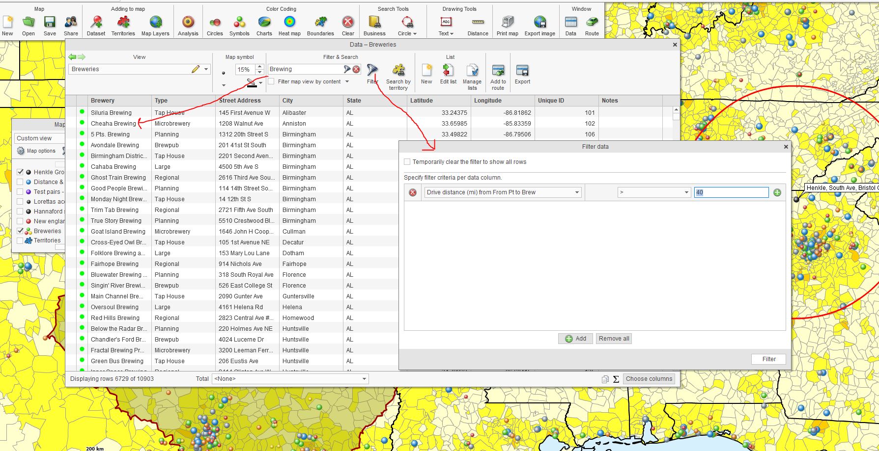
Two Data Window Filtering Options in MapBusinessOnline.
A map creator should remember they can create Data Window columns from spatial query results like driving time queries. These results can then be used for filtering operations.
Quickly Test Adjusted Color-coding Options
In the Color-coding by Symbol dialogue, the map creator can quickly adjust options and get a quick preview of the impact re-symbolizing has on the business map. These adjustments can be viewed rapidly and abandoned if necessary. In this way, the map creator can experiment with various symbolization options to optimize the map view.
Remember to keep things simple and consider your map audience as you fine-tune your color-coding scheme.
Return to the Symbol Dialogue and carriage return through to the color-code assignment page. Once you reach the Setup color-coding (step 2 of 2), try a few adjustments:
- Change the number of data groups to create new coloring options. Consider just 3 or 4 ranges instead of higher numbers, which can distract the map viewer.
- Keep symbol sizes reasonably low to accommodate a non-cluttered map view – I prefer between 15 and 40%.
- Try various color options, including the prefabricated multi-color scheme listed. Avoid overly bright colors.
- Consider alternative data columns for color-shading if you have alternatives. Maps may reflect specific data better than others.
A pair of Blue Arrow icons is positioned just about the Symbol Size percentage column. Use that button to apply changes in your color/symbol scheme. Then click Preview to see the changes without applying them. Again, tweak the controls, click the double blue arrows to assign the changes, and then click Preview.
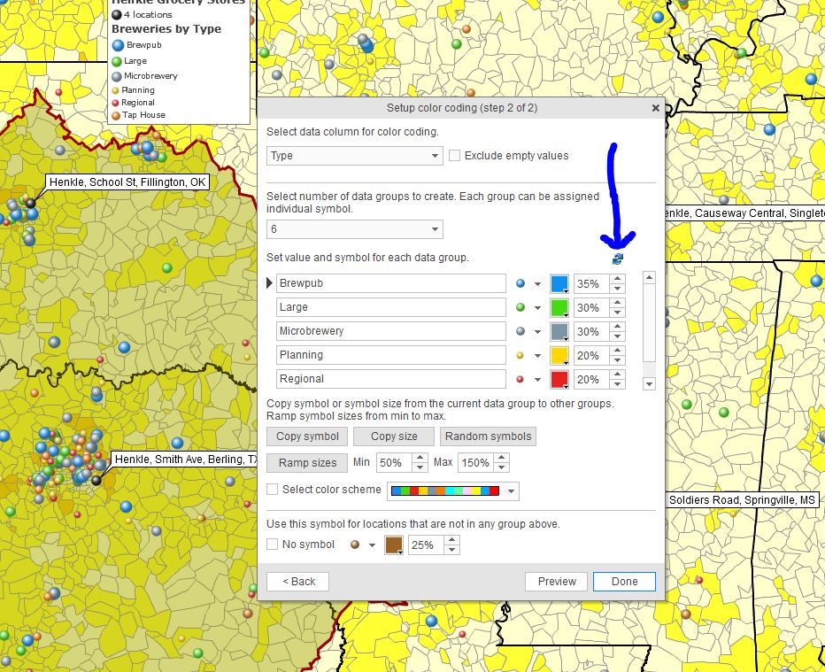
The Alleged Pair of Blue Arrows.
View your business map as a work in progress. There’s always room for improvement. Keeping an open mind and a flexible approach to mapping will only improve your map’s ability to get the point across. Color-code symbols can be powerful representations of your business data.
Further Reading:
- How to create a heat map using MapBusinessOnline.
- Sales territory mapping.
- How do I optimize my map visualization?
_______________________________________________
Discover why over 25,000 business users log into www.MapBusinessOnline.com for their business mapping software and advanced sales territory mapping solution. The best replacement for Microsoft MapPoint happens to be the most affordable.
To access MapBusinessOnline, please register and download the Map App from the website – https://www.mapbusinessonline.com/App-Download.aspx.
After installing the Map App, the MapBusinessOnline launch button will be in the Windows Start Menu or Mac Application folder. Find the MapBusinessOnline folder in the Start Menu scrollbar. Click the folder’s dropdown arrow and choose the MapBusinessOnline option.
The Map App includes the Map Viewer app for free non-subscriber map sharing.
Please read customer reviews or review us at Capterra or g2crowd.
Contact: Geoffrey Ives at geoffives@spatialteq.com or Jason Henderson at jhenderson@spatialteq.com.